
13.3 Types of Presentation Aids
Now that we’ve explored some basic hints for preparing visual aids, let’s look at the most common types of visual aids: charts, graphs, representations, objects/models, and people.
Charts
A chart is commonly defined as a graphical representation of data (often numerical) or a sketch representing an ordered process. Whether you create your charts or do research to find charts that already exist, it is important for them to exactly match the specific purpose in your speech. The rest of this section will explore three common types of charts: statistical charts, sequence-of-steps chart, and decision trees.
Statistical Charts
For most audiences, statistical presentations must be kept as simple as possible, and they must be explained. Unless you are familiar with statistics, this type of chart may be very confusing. When visually displaying information from a quantitative study, you need to make sure that you understand the material and can successfully and simply explain how one should interpret the data. If you are unsure about the data yourself, then you should probably not use this type of information. This is definitely an example of a visual aid that, though it delivers a limited kind of information, does not speak for itself. On the other hand, if you are presenting to an upper level or graduate class in health sciences or to professionals in health occupations, this chart would be appropriate. As with all other principles of public speaking, KNOW YOUR AUDIENCE.
Sequence-of-Steps Charts
Charts are also useful when you are trying to explain a process that involves several steps. The visual aid below depicts the process of group development using a sequence-of-steps chart. Notice that the chart includes labels to indicate the different phases of group development that you will learn more about in Chapter 15. Additionally, the chart contains a visual that depicts movement through the different stages and contains more specific details about each stage of group development. Adding these more specific details helps your audience understand the process.

Decision Trees
Decision trees are useful for showing the relationships between ideas. The chart below shows how a decision tree could be used to determine whether or not to drink coffee. As with the other types of charts, you want to be sure that the information in the chart is relevant to the purpose of your speech and that each question and decision is clearly labeled.

Graphs
Strictly speaking, a graph may be considered a type of chart, but graphs are so widely used that we will discuss them separately. A graph is a pictorial representation of the relationships of quantitative data using dots, lines, bars, pie slices, and the like. Graphs show how one factor (such as size, weight, number of items) varies in comparison to other items. Whereas a statistical chart may report the mean ages of individuals entering college, a graph would show how the mean age changes over time. A statistical chart may report the amount of computers sold in the United States, while a graph will use bars or lines to show their breakdown by operating systems such as Windows, Macintosh, and Linux.
Public speakers can show graphs using a range of different formats. Some of those formats are specialized for various professional fields. Very complex graphs often contain too much information that is not related to the purpose of a student’s speech. If the graph is cluttered, it becomes difficult to comprehend. In this section, we’re going to analyze the common graphs speakers utilize in their speeches: line graphs, bar graphs, pie graphs, and pictographs.
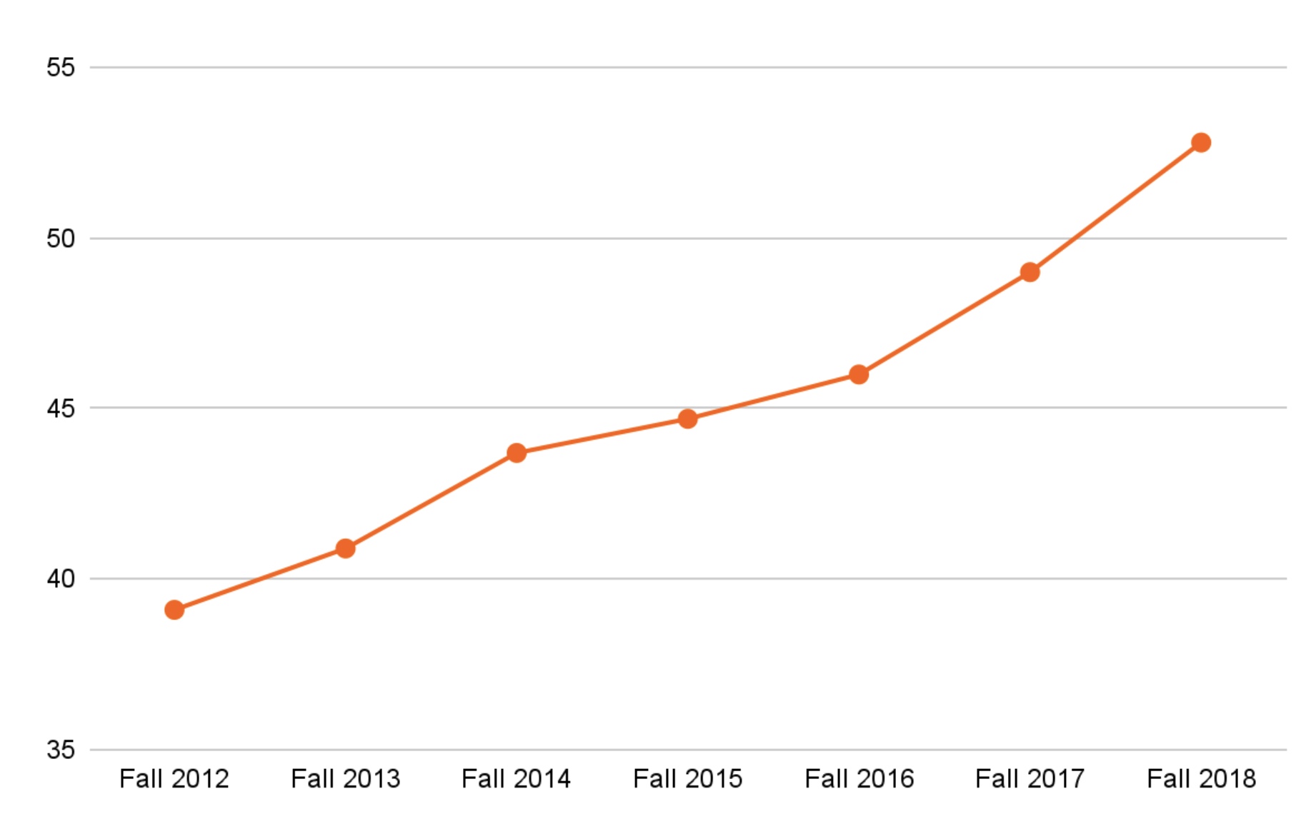
Line Graph
A line graph is designed to show trends over time. In the image below, we see a line graph depicting the four-year graduation percentage rate of new freshmen at Oklahoma State. Notice that the four-year graduation rate has seen a steady increase since Fall of 2012. This is far more effective in showing the relationship of numbers than simply reading the numbers aloud.

Bar Graph
Bar graphs are useful for showing the differences between quantities. They can be used for population demographics, fuel costs, math ability in different grades, and many other kinds of data. The graph below is well designed. It is relatively simple and is carefully labeled, making it easy for the speaker to guide the audience through the recorded numbers of students enrolled in each college at Oklahoma State in the Spring of 2023. The bar graph is designed to show how many students makes up each college. When you look at the data, the first grouping clearly shows that a large number of students at OSU major in a field in the College of Arts and Sciences.

Pie Graph
Pie graphs are usually depicted as circles and are designed to show proportional relationships within sets of data; in other words, they show parts of or percentages of a whole. They should be simplified as much as possible without eliminating important information. As with other graphs, the sections of the pie need to be plotted proportionally. In the pie graph shown below, we see a clear and proportional chart that has been color-coded. Color-coding is useful when it’s difficult to fit the explanations in the actual sections of the graph; in that case, you may need to include a legend, or key, to indicate what the colors in the graph mean. In this graph, audience members can see very quickly that Oklahoma State’s 2022 student body was mostly made up of white students.

Pictograph
Similar to bar graphs, pictographs use numbers and/or sizes of iconic symbols to dramatize differences in amounts. Check out the example below that displays OSU’s undergraduate student classification in the Fall of 2022. Pictographs, although interesting, do not allow for depiction of specific statistical data. If you were trying to show the output of oil from various countries through oil wells, each oil well representing a ten million barrels a day, it might be hard for the audience to see the difference between a third of an oil well and a fourth of one, but that is a significant difference in amounts (3.3 million versus 2.5 million).

Graphs can present challenges in being effective but also in being ethical. To be both ethical and effective, you need a good understanding of what statistics mean, and you need to create or use graphs that show amounts clearly. For example, if you were showing GPAs of freshmen, sophomore, junior, and senior students at your college, and the bottom number on the graph was 2.25 rather than 0.0, that would result in a visually bigger difference than what really exists .
Diagrams
Diagrams are drawings or sketches that outline and explain the parts of an object, process, or phenomenon that cannot be readily seen. Like graphs, diagrams can be considered a type of chart, as in the case of organizational charts and process-flow charts. When you use a diagram, be sure to explain each part of the phenomenon, paying special attention to elements that are complicated or prone to misunderstanding. You will likely recognize the example below from Chapter One; this diagram describes the linear model of communication. This diagram provides a visual representation of the process of communication as well as the key components in that process.

Maps
Maps are extremely useful if the information is clear and limited. There are all kinds of maps, including population, weather, ocean current, political, and economic maps, so you should find the right kind for the purpose of your speech. Choose a map that emphasizes the information you need to deliver. The map shown below (“African Map with Nigerian Emphasis”) is simple, showing clearly the geographic location of Nigeria. This can be extremely valuable for some audiences who might not be able to name and locate countries on the continent of Africa. The map also shows the relative size of Nigeria compared to its neighbors.

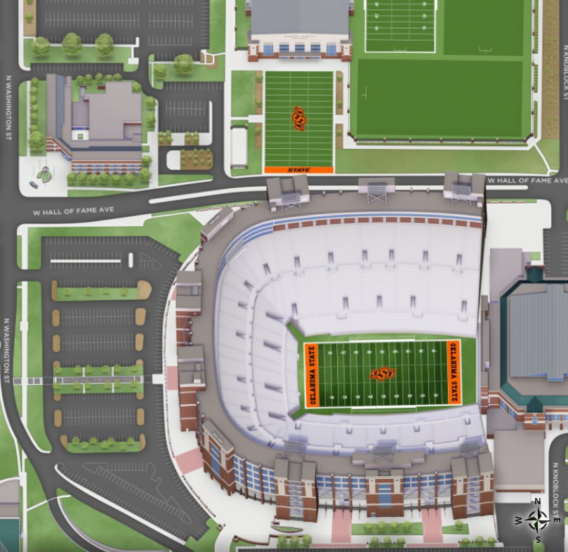
Below is another example of a map that has been scaled for emphasis. You might recognize this image from OSU’s online interactive campus map. You might be especially familiar with the emphasized portion of the map, Boone Pickens Stadium. When using maps for presentation aids, make sure to clarify the aspects of the map that you want the audience to understand.
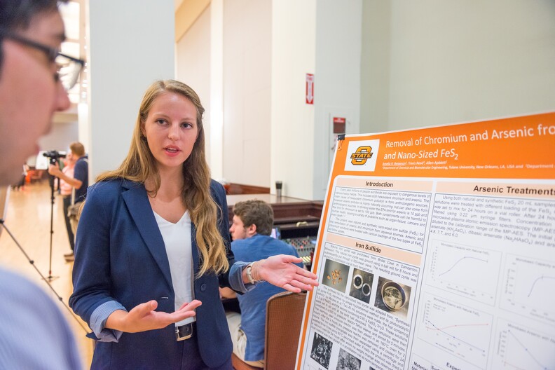
Photographs and Drawings
Sometimes a photograph or a drawing is the best way to show an unfamiliar but important detail. The photograph below pictures the fountain in front of Edmon Low Library after it has been dyed orange for OSU’s annual Homecoming celebration. This photograph might be a good presentation aid for a speech about Oklahoma State’s Homecoming traditions. Audiences expect high quality in photographs now, and as with all presentation aids they should enhance the speech and not just “be there.” It is common to put stock photographs on PowerPoint slides as “clip art,” but they should be relevant and not detract from the message of the slide.

Video or Audio Recordings
Another very useful type of presentation aid is a video or audio recording. Whether it is a short video from a website such as YouTube or Vimeo, a segment from a song, or a piece of a podcast, a well-chosen video or audio recording may be a good choice to enhance your speech. Imagine, for example, that you’re giving a speech on how Lap-Band surgeries help people lose weight. One of the sections of your speech could explain how the Lap-Band works, so you could easily show a forty-three second video available on YouTube to demonstrate the part of the surgery. Maybe you could include a recording of a real patient explaining why they decided to get the Lap-Band.
There is one major warning to using audio and video clips during a speech: do not forget that they are supposed to be aids to your speech, not the speech itself. In addition, be sure to avoid these five mistakes that speakers often make when using audio and video clips:
- Avoid choosing clips that are too long for the overall length of the speech. Your instructor can give you some guidelines for how long video and audio clips should be for the speeches in your class, if they are allowed (and make sure they are).
- Practice with the audio or video equipment prior to speaking. If you are unfamiliar with the equipment, you’ll look foolish trying to figure out how it works. This fiddling around will not only take your audience out of your speech but also have a negative impact on your credibility. It also wastes valuable time. Finally, be sure that the speakers on the computer are on and at the right volume level.
- Cue the clip to the appropriate place prior to beginning your speech. We cannot tell you the number of times we’ve seen students spend valuable speech time trying to find a clip on YouTube or a DVD. You need to make sure your clip is ready to go before you start speaking. Later in this chapter we will look at using video links in slides.
- In addition to cuing the clip to the appropriate place, the browser window should be open and ready to go. If there are advertisements before the video, be sure to have the video cued to play after the ad. The audience should not have to sit through a commercial. There is a website called TubeChop that can allow you to cut a segment out of a YouTube video, then creating a new link. It has limitations but can be useful.
- The audience must be given context before a video or audio clip is played, specifically what the clip is and why it relates to the speech. At the same time, the video should not repeat what you have already said, but add to it.
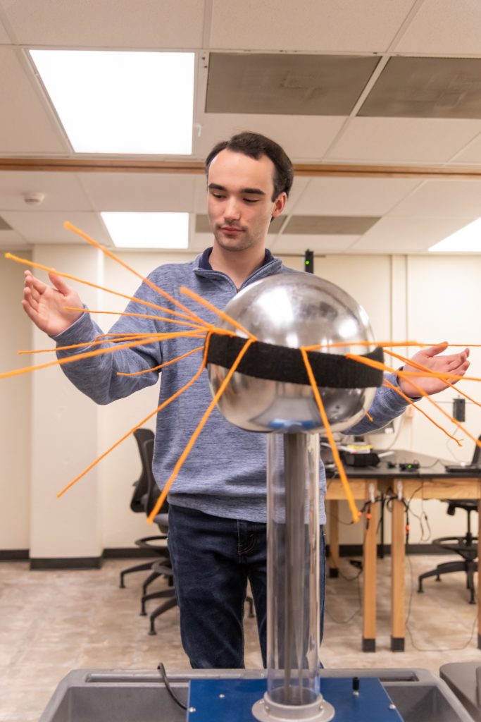
Objects or Models
Objects and models are another form of presentation aid that can be very helpful in getting your audience to understand your message. Objects refer to anything you could hold up and talk about during your speech. If you’re talking about the importance of not using plastic water bottles, you might hold up a plastic water bottle and a stainless steel water bottle as examples. Models, on the other hand, are re-creations of physical objects that you cannot have readily available with you during a speech. If you’re giving a speech on heart murmurs, you may be able to show how heart murmurs work by holding up a model of the human heart. As will be discussed in the section on handouts below, a speaker should not pass an object or model around during a speech. It is highly distracting.
People and Animals
The next category of presentation aids are people and animals. We can often use ourselves or other people to adequately demonstrate an idea during our speeches.
Animals as Presentation Aids
When giving a speech on a topic relating to animals, it is often tempting to bring an animal to serve as your presentation aid. While this can sometimes add a very engaging dimension to the speech, it carries some serious risks that you need to consider.
The first risk is that animal behavior tends to be unpredictable. You may think this won’t be a problem if your presentation aid animal is small enough to be kept confined throughout your speech—for example, a goldfish in a bowl or a lizard or bird in a cage. However, even caged animals can be very distracting to your audience if they run about, chirp, or exhibit other agitated behavior. The chances are great that an animal will react to the stress of an unfamiliar situation by displaying behavior that does not contribute positively to your speech or to the cleanliness of the physical environment. Additionally, the animal’s behavior may not only affect audience attention during your speech, but potentially during your classmates’ speeches as well.
The second risk is that some audience members may respond negatively to a live animal. In addition to common fears and aversions to animals like snakes, spiders, and mice, many people have allergies to various animals. One of the authors had an experience where a student brought his six-foot yellow python to class for a speech. As a result, one of the other students refused to stay in the room because of her snake phobia (the instructor was not too comfortable either).
The third risk is that some locations may have regulations about bringing non-service animals onto the premises. If animals are allowed, the person bringing the animal may be required to bring a veterinary certificate or may be legally responsible for any damage caused by the animal.
For these reasons, before you decide to use an animal as a presentation aid, ask yourself if you could make your point equally well with a picture, model, diagram, or other representation of the animal in question.
Speaker as Presentation Aid
Speakers can often use their own bodies to demonstrate facets of a speech. If your speech is about ballroom dancing or ballet, you might use your body to demonstrate the basic moves in the cha-cha or the five basic ballet positions.
Other People as Presentation Aids
In some cases, such as for a demonstration speech, you might want to ask someone else to serve as your presentation aid. You should arrange ahead of time for a person (or persons) to be an effective aid—do not assume that an audience member will volunteer on the spot. If you plan to demonstrate how to immobilize a broken bone, your volunteer must know ahead of time that you will touch them as much as necessary to splint the break.
You must also make certain that they will arrive dressed presentably and that they will not draw attention away from your message through their appearance or behavior. The transaction between you and your human presentation aid must be appropriate, especially if you are going to demonstrate something like a dance step. In short, make sure your helper will know what is expected of them and consents to it
a graphical representation of data (often numerical) or a sketch representing an ordered process
a pictorial representation of the relationships of quantitative data using dots, lines, bars, pie slices, and the like
a graph designed to show trends over time
a graph designed to show the differences between quantities
a graph designed to show proportional relationships within sets of data
a graph using iconic symbols to dramatize differences in amounts
drawings or sketches that outline and explain the parts of an object, process, or phenomenon that cannot be readily seen
