Editing
The very earliest films comprised only a single shot, just as some filmmakers have experimented with full-length feature films presented without any cutting. Apart from these exceptions, though, all films feature editing, which involves the assembly of separate shots for the construction of individual scenes, entire sequences, and the film as a whole. Given that editing is almost unavoidable, the most fundamental question regarding the practice is this: What factors determine how any two shots should be linked together? What types of connection are made possible through editing? In this chapter, we will see that filmmakers have developed an extremely broad range of possibilities for the relatively simple question of how to link Shot A to Shot B. The chapter will present these editing conventions, which function like a toolkit for filmmakers to rely on when constructing a film. It is important to remember that these conventions function at different levels of narrative action (sometimes pertaining to a single action, or to a scene, or to the film as a whole) and that they can operate simultaneously.
TRANSITIONS
There are variations in the manner of how to transition between Shot A and Shot B.
Cut. The most basic and most common transition, involving the immediate and clear replacement of one shot for the next.
Dissolve. Distinct from the immediate and clear transition of the cut, this transition involves the gradual replacement of one shot for the next, creating a temporary overlap of the two.
Fade-in. A specific variation of the dissolve, this is a gradual transition from a black frame to an image, typically used to introduce a new scene.
Fade-out. A specific variation of the dissolve, this is a gradual transition from an image to a black frame, typically used to conclude a scene.
Wipe. This is a visible transition between two shots, wherein a line or shape passes across the frame, carrying out the replacement of one image for the next. George Lucas’s Star Wars films are well known for their frequent use of wipes.
EDITING A SINGLE ACTION
Editing can approximate a real-time representation of an action, showing that action in its entirety. But as we know, story and plot are not the same, and editing can facilitate some of plot’s temporal manipulation of the story action. We can identify two editing conventions that involve temporal deviations from the approximation of real time.
Overlapping editing
In this convention, a story action is immediately repeated through editing, presenting different views of the action in quick succession. In Sergei Eisenstein’s Battleship Potemkin (USSR, 1925), sailors mutiny against their superiors in protest of their deplorable living conditions, including having to eat rotting meat. Eisenstein presents the start of their mutiny by repeating a single action through overlapping editing. A sailor smashes a plate. In reality, a plate can only be smashed once, but Eisenstein shows the sailor lifting his arm and breaking the plate multiple times, highlighting the significance of this moment of resistance.
Elliptical editing
Whereas overlapping editing repeats and therefore extends a story action, elliptical editing skips over segments of the action in the plot’s presentation of the event. Story action is thereby elided, just as an ellipsis in written language leaves out portions of a sentence. This convention is much more common than overlapping editing. For example, a real-time presentation of a character returning home to their sixth-floor apartment would show that character entering their building, walking up each flight of stairs, and then entering their apartment. But as this action does not have narrative significance, a film director can simply suggest the completion of this action through elliptical editing, as in the clip below. It is sufficient, in other words, to cut from a shot of the character entering the building to a shot of that character at the top of the stairs arriving at their apartment. The viewer is able to infer that they took the stairs without the director having to show it in its entirety. This elision of narrative action is frequently used. We will discuss a more expansive but less common use of elliptical editing later in this chapter.
EDITING A SCENE
There are many ways to construct a scene as an autonomous section of a film’s overall narrative. However, we can isolate two editing conventions that have historically guided scene construction: analytical editing and constructive editing. Both conventions are responses to the idea that if a director is not going to present a scene in a single shot, simply allowing the action to play out in full in front of the camera without cutting, then some logic should inform how the shots are assembled. In other words, if a film is going to fragment one unified scene into separate parts, how does the director decide what these parts should be and how they should be linked together? These conventions sought to solve the problem of narrative clarity the film industry encountered as it transitioned to narrative feature filmmaking, which we discussed in the previous chapter in relation to Tom Tom the Piper’s Son (1905). There, we had emphasized that viewers were likely to miss the narratively significant action of stealing a pig, which sets off the chase structuring the film, because the film was not guiding the viewer’s attention through editing (i.e. cutting to a close-up of the theft). These editing conventions are two different organizational logics for constructing a scene in a way that directs the spectator toward narratively important information.
Analytical editing
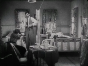
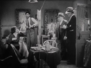
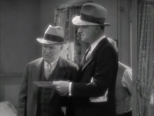
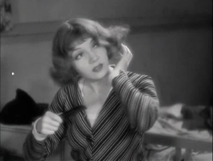
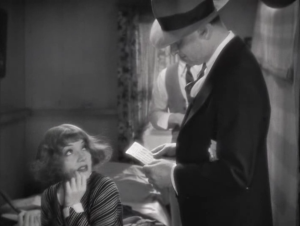
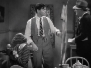
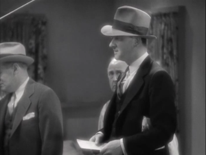
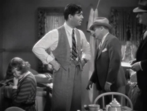
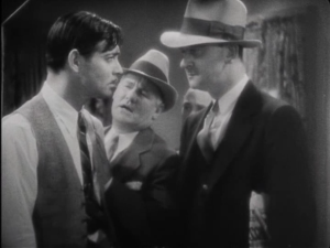
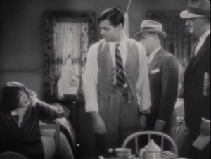
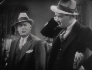
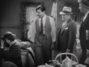
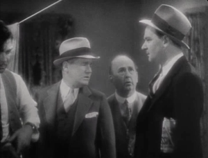
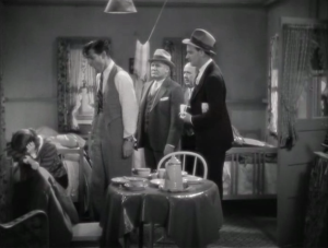
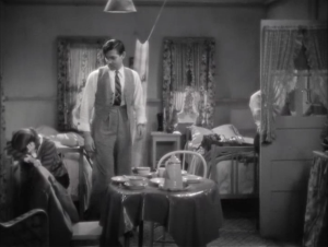
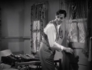
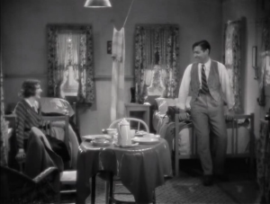
Analytical editing follows the overall pattern of whole-part-whole. It typically opens a scene with an establishing shot, defined as a shot that establishes the setting of the scene or more specifically, the relative positions of the characters to the set and to each other. An establishing shot provides a sense of the whole space in which a scene takes place. Analytical editing then describes how this whole is taken apart (into separate shots) and reassembled according to the dramatic logic of the scene. For example, if there are three characters in a scene but one moment involves dramatic tension between two of them, then the film might use framing to isolate these two to the exclusion of the third, only reintegrating that third character once the moment is completed. Or, for example, if a character hears a noise outside of their bedroom signaling a possible intruder, then the film might cut to a close-up of the doorknob being turned as the intruder tries to enter. The essential point is that a scene is constructed through editing in a way that “analyzes” the narrative space according to the needs of the story, assembling the parts depending on where the viewer’s attention needs to be. In its classical form, analytical editing tends to close a scene with a reestablishing shot which specifies the new whole created by the change carried out by the scene.
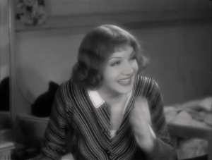
Let’s examine an example from classical Hollywood cinema. In the screwball comedy It Happened One Night (Frank Capra, US, 1934), the heiress Ellie Andrews (Claudette Colbert) flees from her father’s yacht after he disapproves of her elopement. On the run, she meets the working-class journalist Peter (Clark Gable), and he helps her to hide out. In this scene, detectives show up at their roadside motel in search of Ellie, and the two pose as a bickering married couple in order to prevent being identified.
 |
 |
 |
 |
 |
 |
 |
 |
 |
 |
 |
 |
 |
 |
 |
 |
 |
 |
Constructive editing
Constructive editing follows the overall pattern of part-part-part. Rather than disassembling a whole given at the start, this type of scene construction only provides the pieces of a fragmented whole, and it relies on the viewer to infer the relations between them. Let’s take an imagined example. Consider this sequence of shots: a medium shot of a barista making a drink, a medium shot of a man seated at a table, a close-up of his nearly empty coffee cup, a long shot of a woman as she walks through a door from the outside, a close-up of the man smiling, and so on. Though we are only given parts of the space, it is not difficult for us to infer that this scene involves the meeting of a man and a woman at a coffeeshop. We do not need an establishing shot that shows the whole space. Instead, we can construct that whole by putting together the pieces ourselves.
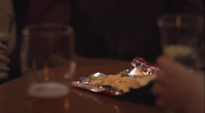
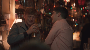
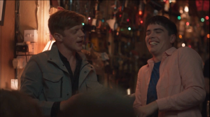
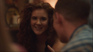
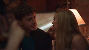
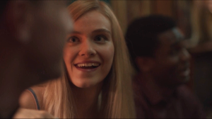
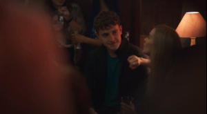
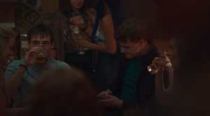
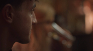
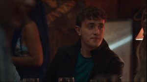
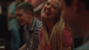
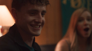
The following example from the TV miniseries Normal People (Hulu, 2020) provides one typical use of constructive editing. The brief scene presents the series’ main character Connell (Paul Mescal) at a bar with friends. Lacking an establishing shot, the viewer must infer the location, the relative positions of the actors in the space, and the central dramatic purpose of the scene. Some shots serve this purpose, but others simply establish the atmosphere of the space. The central conflict here is an internal one, as Connell receives a text message from his secret girlfriend. However, the scene formally underplays its significance, leaving the viewer to intuit its dramatic importance by constructing the scene’s small details together.
 |
 |
 |
 |
 |
 |
 |
 |
 |
 |
 |
 |
 |
 |
CONTINUITY EDITING: THE CLASSICAL SYSTEM OF SHOT ASSEMBLY
Continuity editing describes a formalized set of conventions that act as guidelines for shot assembly in narrative filmmaking. Though this set of conventions was largely developed beginning in the 1910s, continuity editing continues to define the basic principles of mainstream narrative cinema today. Any aspiring film director needs to learn the “rules” set down by continuity editing before they can break them. In this sense, continuity editing establishes the fundamental baseline for film editing, the default standard against which other innovations stake their novelty.
Before outlining the conventions that comprise continuity editing, let’s consider the problem it was designed to solve. How is it, we might ask, that we are able to follow a story when we watch a film? How are we able to see in the sequence of images a series of causally related events or feel the sense of a coherent diegetic world? After all, there is no guarantee that when a film connects Shot A to Shot B through editing that they will bear any relation to each other. Shot A could show a shot of an action taking place in bright daylight, and then cut to Shot B showing an action in the rain. Has time passed between them, allowing for the weather to change? Do they take place in different locations? The viewer is likely confused. Where are we in the story? When are we? Editing always has the potential to disorient or confuse the spectator as to story’s spatial orientation or temporal dimension.
Continuity editing describes a set of conventions whose function is to construct a stable and coherent diegesis, thereby minimizing any potential confusion by the viewer as to where and when an action is taking place. Fundamentally, its purpose is to maintain consistent screen direction, meaning that spatial and temporal relations remain comprehensible and stable across an assembly of shots. Space and time are understood to be continuous across shots, rather than seeming like a series of images that are unrelated or incoherent.
How does continuity editing maximize narrative clarity through the maintenance of consistent screen direction? What “rules” or conventions does it use?
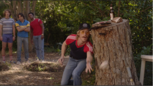
180-degree rule. Consider this simple action: a baseball pitcher throws a pitch toward a batter. The pitcher, seen in Shot A, faces frame right and throws the ball. It leaves the frame in the same direction. If Shot B shows the batter, which way should he be facing? Frame left, because that’s the direction we expect the ball to enter the frame based on the previous shot. This is what is meant by consistent screen direction. Relative positions and movements are continuous from one shot to the next. This depends, however, on accurate camera placement during filming.
The 180-degree rule specifies where the camera can be placed so that consistent screen direction will be maintained. Every action or interaction within the diegesis takes place along an axis of action, which we can picture as an imaginary line running across the set as determined by the relative positions of characters or objects in the scene.
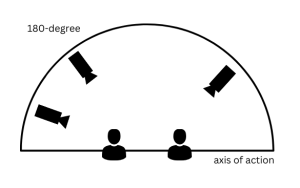
The 180-degree rule states that, for any particular staging of actors within a scene, as long as the camera remains on one side of the axis of action, then consistent screen direction will be maintained. It is named for the 180-degree semi-circle that lies to one side of the axis; the camera can be placed anywhere within this semi-circle. In the example above, the axis of action runs between pitcher and batter, so as long as the camera keeps to one side, the pitcher will always appear to be looking frame right and the batter will always appear to be looking frame left.
 |
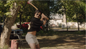 |
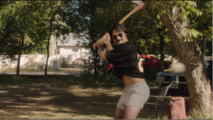
Now let’s imagine a director breaks this rule. Shot A might still show the pitcher throwing the ball offscreen frame right, but if for Shot B, the director placed the camera on the other side of the axis of action, then the batter will now also appear to be looking frame right. Rather than seeming to face each other, they are looking in the same direction. The spectator is now confused as to where they are in relation to each other.
 |
 |
We will consider variations of or complications to the 180-degree rule later in this chapter, but first we will outline the other conventions that define continuity editing.
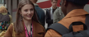
Eyeline match. Like the axis of action, an eyeline is an imaginary line that we can imagine as extending in the direction of a character’s gaze. In continuity editing, the eyelines of characters are said to “match” if they appear to meet along the same line. If a filmmaker follows the 180-degree rule, this will result in matching eyelines. Eyelines are also used to cue the viewer to anticipate what the next shot will depict across the edit. For example, an actor might be looking frame left in the direction of one character, and then we notice that she shifts her gaze to frame right. What has drawn her attention? What is she now looking toward? Conventionally, the next shot will supply the answer, by depicting whatever lies in the direction of her look. In this way, eyelines train the viewer to expect or anticipate an edit.
 |
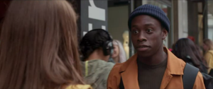 |
Shot-reverse shot. This is an editing convention that often relies on an eyeline match. It involves an alternation between two perspectives, often between two characters in conversation or between a character looking and what that character is looking at. The reverse shot is so-called because it provides the viewpoint that the first shot implies but does not show.
Match on action. This convention is defined as the use of continuous action to bridge separate shots linked by editing. The cut from Shot A to Shot B, in other words, interrupts an action, only for it to continue in the following shot. For example, in Halloween (John Carpenter, US, 1978), Laurie (Jamie Lee Curtis) opens her car door in a long shot and begins the action of getting in the car. The edit interrupts this action, but she completes the act of getting in the car in the following medium shot. Two shots are linked by a single continuous action.
PARALLEL EDITING (CROSSCUTTING)
This convention is often utilized in continuity editing, but we can distinguish it as a separate type of editing. It involves the alternation between two lines of action that are spatially discontinuous but understood to be temporally simultaneous. It is an extremely common formal device, familiar to spectators, but this was not always the case. In cinema’s earliest years, it was believed that cutting away from an action before its completion would confuse spectators. Instead of alternating between two actions, early silent films would repeat them. Consider the film The Life of an American Fireman (Edwin Porter, US, 1903), which narrates the simple story of the rescue of a mother and child from a burning building. The rescue is first shown from the interior of the family’s third-floor apartment, as we see the fireman’s ladder come through the window and firemen climb through to carry mother and child to safety. This action then is repeated in its entirety from the perspective of those outside of the building. Smoke pours out of a window, a fire truck arrives and raises its ladder to the third floor, and firemen disappear into the building until they emerge with the mother and child. The same rescue occurs twice. Once the convention of crosscutting was developed, however, a film director could rely on the spectator to understand that, though the film cuts between the discontinuous spaces (interior/exterior), that what is depicted is happening at the same time.
A “ride to the rescue” quickly became a typical yet still dramatic use of parallel editing. Take the familiar scenario of early Hollywood melodrama of the “damsel in distress,” involving for example, a young woman tied to the railroad tracks by a malevolent figure. The train is fast approaching and the hero hurries to arrive in time to save her. The director will crosscut between the damsel and the hero, between one space and the other, knowing that the spectator will understand them to be “parallel” to each other – spatially separated but temporally simultaneous. Parallel editing is useful therefore for the creation of narrative suspense.
Parallel editing is also used to bring together multiple (more than two) lines of action. In the season four finale of Stranger Things (Netflix, US, 2016- ), for example, the climactic confrontation with Vecna alternates between multiple characters in different locations: Eleven and Max being held captive by Vecna in the Upside Down, Mike and Will in the fast food restaurant, Lucas’s fight with Jason in an attic, Eddie being attacked by Vecna’s creatures, and Jim fighting a demogorgon in Russia. This editing choice emphasizes that the actions in one storyline have immediate consequences for the characters of other storylines. The parallel editing underlines the mutual dependency of these lines of action.
Sometimes a film director can upend the viewer’s expectations by playing with this convention. The climax of Jonathan Demme’s serial-killer film The Silence of the Lambs (US, 1991) does this. FBI agent Clarice Starling (Jodie Foster) searches for a murderer named Buffalo Bill (Ted Levine). Toward the end of the film, Demme crosscuts between three lines of action: Starling arriving on her own to a home in pursuit of a potential lead, FBI agents raiding a house they believe to be Buffalo Bill’s, and Buffalo Bill in his basement overseeing his most recent captive. As part of the FBI raid, an agent rings the doorbell to a home, posing as a deliveryman, and through crosscutting, Buffalo Bill appears irritated as he hears an alarm indicating that someone is outside his house. The crosscutting leads us to think that this alarm is connected to the agent’s ringing of the doorbell, but when the FBI raid the house, they find nothing there. Demme then cuts to Buffalo Bill opening his front door to find Starling there, though she does not yet know she has found the killer. The alarm in Buffalo Bill’s basement had been from Starling ringing the doorbell at her location. Why did Demme present the scene in this way? Its effect pertains to more than just narrative suspense. Much of the film has emphasized the way that Starling, as a female agent, has been underestimated and objectified by her male colleagues. Therefore, when Starling pursues a lead on her own while the other agents raid a different house, the film wants us to falsely assume that Starling is following a dead end. The surprise revelation that she has located the killer’s home challenges those assumptions about her competence and perceptiveness.
ALTERNATIVES TO CONTINUITY EDITING
Continuity editing can be described by the following two characteristics. First, it is a self-effacing style of editing. Its conventions are relatively “invisible,” meaning that the viewer tends not to notice them. For example, this is the idea behind a match on action, since cutting during an action causes the viewer to overlook the edit. Its purpose is to place focus on the story action. Continuity editing is designed to be in service to the narrative. Editing choices appear to be “natural,” motivated or justified by the needs of the story, such as the use of a close-up to provide a close view of a narratively significant detail. Second, in continuity editing, the primary connections between images are spatial and temporal relations. Continuity editing organizes the space and time of the diegesis into a coherent whole so that the viewer can easily comprehend the story.
The alternatives to continuity editing we will outline in this section generally depart from both of these characteristics. Rather than self-effacing, they tend to be noticeable, and rather than remaining subordinate to the narrative, they tend to be relatively extraneous to story action. If continuity editing is the standard style of narration in classical form, these alternatives are more likely to be found in cinema’s anti-classical modes.
It is important to understand that continuity editing and its alternatives are not mutually exclusive. A film that otherwise consistently adheres to the rules of continuity editing can include a sequence featuring one of these alternatives.
Rhythmic Editing
This type of editing creates a temporal patterning of images in sequence. By controlling for shot length, a director can produce different formal patterns – including, for example, acceleration or deceleration, or a steady beat or a more complex musical structure. Rhythmic editing is sometimes motivated by story action. For example, an early example of the practice is found in Abel Ganc’s La Roue/The Wheel (France, 1922), in which the increasing speed of a train is suggested by a progressive shortening of shot length. In Requiem for a Dream (Darren Aronofsky, US, 2000), the compulsive nature of addiction (to drugs, coffee, television…) is represented through a series of fast cuts, each lasting 9 frames/.375 seconds, that repeat throughout the film. Rhythmic editing can also function independently of story. The trailer for David Fincher’s The Girl with the Dragon Tattoo (US, 2011) consists entirely of one-second shots, producing a steady metrical beat of images irrespective of any coherent story logic. Films will also sometimes “cut to music” where the editing of images follows the beat or melody of a song. That is the case in one sequence from Moulin Rouge! (Baz Luhrmann, US, 2001). In the “El Tango de Roxanne” sequence, when the courtesan Satine (Nicole Kidman) is nearly assaulted by the Duke (Richard Roxburgh), the editing pattern follows the pacing set by the tango recording of “Roxanne” by The Police.
Elliptical Editing
Earlier in this chapter, we considered elliptical editing as it applies to the depiction of a single action. Used that way, it is a common feature of continuity editing, since it leaves out or skips over action that is not narratively significant. When used more broadly across an entire film, though, it tends to disrupt continuity editing’s emphasis on narrative clarity. In this version of elliptical editing, individual scenes as well as the transitions between scenes exclude important story events. The film might show an effect of an action without showing its cause, or it might show the initiating cause of a line of action without ever revealing its effect. It might simply excise large stretches of time in a character’s storyline without explanation. The viewer is left to infer what happens, to reconstruct the story from the partial elements one is given. For example, director Agnes Varda gives an elliptical form to her 1985 film Vagabond. The film follows an itinerant woman named Mona (Sandrine Bonnaire) who wanders and hitchhikes without purpose or direction, encountering other people along the way, many of whom want to exploit her. Varda strings together different sequences that sometimes have little connection to one another. Characters appear in one sequence and then disappear from the film, or reappear only in the background of another scene. The elliptical editing of the film therefore creates ambiguous spatial and temporal relationships, where viewers are unable to precisely determine the relationship between events.
Discontinuity Editing
This type of editing violates the rules of continuity editing. By breaking its conventions, discontinuity editing disrupts continuous spatial and temporal relations. Rather than creating a coherent diegesis, it flaunts the artificiality of cinema’s construction of space and time. It can be identified by its following conventions:
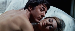
False match on action. A match on action bridges two shots by having an action carry over from the one the next. A false match on action disrupts our expectation of continuity based on our familiarity with this convention. For example, in The Graduate (Mike Nichols, US, 1967), recent college graduate Benjamin (Dustin Hoffman) is having an affair with Mrs. Robinson (Anne Bancroft), an older woman, unbeknownst to his parents. In a sequence constructed to suggest the ongoing nature of the affair, Benjamin is seen in one shot entering his parents’ home through the backdoor. We expect the next shot to take place in the interior of the home, linked by the action of walking through the doorway. Instead, Benjamin is seen entering a hotel room. Two discontinuous or nonadjacent spaces (his parents’ home, hotel room) are linked across a single continuous action (opening the door). The same sequence ends on another false match on action. Benjamin dives into his parents’ pool, swims to the surface, and begins to leap onto a floating raft. An edit interrupts this action, but instead of landing on the raft, Benjamin appears to land on Mrs. Robinson in their hotel room bed. In a more contemporary example, certain trends on TikTok make use of a false match on action. In one, the content creator, dressed casually, drops a shoe as their foot rises to meet it. Across the transition, the creator now appears to complete the action of swinging their foot, now wearing the shoe, and they are sharply dressed.
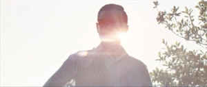
False eyeline match. In continuity editing, if one character looks offscreen right, and the next shot shows another character looking offscreen left, we understand those characters to be looking at each other in the same space at the same time. We called this convention an eyeline match. In discontinuity editing, two characters may appear to be looking at each other through an eyeline match, but from contextual information, we understand them to be in a different space or time.
 |
 |
Jump cut. The general rule for an edit to remain “invisible” or unobtrusive is that the camera position from one shot to the next has to be different by at least 30°. If it is not, the result is called a jump cut. Across an edit, the image appears to “jump” or “stutter,” appearing more like a mistake than an intentional cut. Jean-Luc Godard famously made use of jump cuts in his first feature film Breathless (France, 1960). As Michel (Jean-Paul Belmondo) drives his American girlfriend Patricia (Jean Seberg) around Paris, he frames her in the passenger seat from behind in a high-angle medium shot. As they talk, the background of the street suddenly shifts to an entirely new view, though the camera remains in the same position. Though their dialogue is continuous, Godard repeatedly cuts on the shot of Patricia, skipping ahead in time along their drive.
Crossing the axis of action. According to the 180° rule, the camera should remain on one side of the axis of action in order to maintain consistent screen direction. In discontinuity editing, directors may ignore this rule, resulting in story action with inconsistent screen direction. We can reference another example from Godard’s Breathless. Early in the film, Michel steals a car and is chased by the police. In one shot, Michel’s car is pictured moving from frame left to frame right. In the next shot, the police car is pictured moving from frame right to frame left. This inconsistent screen direction gives the impression that Michel’s car and the police car are driving toward each other rather than the latter pursuing the former in the same direction.
Graphic match. In this convention, two successive shots that are discontinuous in either space or time (or both) are linked by the repetition of a visual element (a color, a shape, etc.) positioned similarly in the frame. Perhaps the most famous graphic match in film history occurs in Stanley Kubrick’s 2001: A Space Odyssey (US, 1968). The opening act of the film takes place in prehistoric times just as humanity’s primate ancestors are learning to use tools. One ape-like figure triumphantly throws a bone in the air. In close-up, we see the bone spinning against the sky, and just as it begins to descend, Kubrick cuts to a spaceship of similar color and shape orbiting Earth. Millions of years pass in the span of a single cut, and through this edit, Kubrick implies that the technological achievement of space travel is no more (or no less) than the evolutionary outcome of throwing an object in the air. In Autumn Afternoon (Japan, 1962), director Yasujiro Ozu makes extensive use of graphic matches to link shots.
Associative editing
This type of editing emphasizes conceptual or poetic links between images rather than emphasizing relations of space and time. Associative editing asks the viewer to draw associations or analogies between juxtaposed images. In Charlie Chaplin’s Modern Times (US, 1936), Chaplin cuts from a shot of businessmen emerging from a crowded subway station to a shot of sheep jostling out of their pen. The sheep have no diegetic connection to the men; they are not part of the story of the film. Instead, Chaplin prompts his viewer to draw a connection between the men and the sheep, something like, modern life makes sheep of men, as it herds and pens them together in a loss of their autonomy as humans. In another example from a film from the same historical period, Sergei Eisenstein’s Strike (USSR, 1925), the director cutss between images of government troops firing upon striking workers and images of a bull being killed in an abattoir. Eisenstein indicates that these two actions, otherwise not diegetically linked, are connected through the idea of “slaughter”: the workers are being cut down like the bull. Eisenstein was among several Soviet directors of this period experimenting with the possibilities of film form.
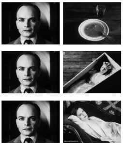
In one such experiment, performed by Lev Kuleshov, an audience was shown a close-up of the face of actor Ivan Mosjoukine, juxtaposed to various depictions: a bowl of soup, a dead child, and scantily dressed woman. In each case, so it was reported, the audience praised the performance of the actor, alternatively expressive of hunger (in the case of the soup), grief (in the case of the child), and desire (in the case of the woman). The “trick” of this experiment, though, was that, in each instance, it was same image of Mosjoukine, with the same facial expression. What it demonstrated is that spectators continually draw associations between images, even to the point of witnessing something otherwise not present (the actor’s emotiveness). In other words, meaning in cinema comes as much from the relations between shots as much from what they depict independently of each other.
ASSOCIATIVE EDITING IN THE PARALLAX VIEW
Alan Pakula’s 1974 film The Parallax View is a thriller about a journalist investigating the assassination of a politician who finds himself ensnared by the very conspiracy he seeks to expose. It is part of Pakula’s “paranoia trilogy,” a series of films released amidst public distrust of the government following the Watergate scandal and the resignation of President Richard Nixon. In one scene, he visits the offices of the Parallax Corporation to determine its connection to the assassination, and there he is shown a short film. The film is presented as a “test” but he is not told what it tests for. We come to understand that the film either tests to determine whether its viewing subject is a potential candidate to carry out an assassination, or functions as a brainwashing technique to prompt some unwitting individual into becoming an assassin. The film itself utilizes associative editing, and therefore serves as an illustrative example of this film technique.
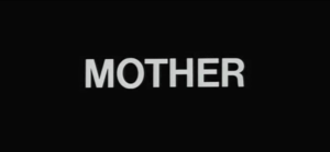
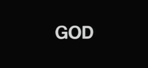
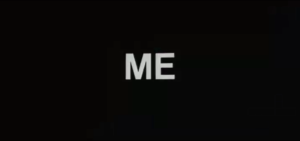
The film is comprised entirely of still images that are presented in a slideshow manner. The images are either title cards bearing a single word (“Love,” “Mother,” “Father,” “Me,” “Home,” “Country,” “God,” “Enemy,” and “Happiness”) or photographs characteristic of an American lifestyle. In the first sequence, the photographs appear to illustrate the word that precedes them. For example, the three images that follow “Mother” show mothers nurturing their babies and a grandmother sewing, and the images that follow “Country” show the Statue of Liberty at sunset, a detail from a painting of George Washington, then a larger excerpt of the painting, and three images of presidents (Mount Rushmore, the Lincoln Memorial, and Nixon in the Oval Office).
 |
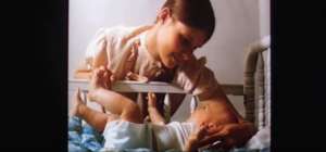 |
Associative editing relies on the principle that viewers are continually drawing connections between juxtaposed images, and in this early sequence, we can say that relationship between the displayed words and the subsequent photographs is a stable one, indicative of a stereotypical conception of American life.
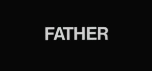
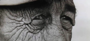
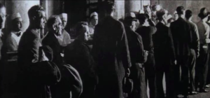
Then a slippage happens. The first repetition of the title card “Father” is followed by Depression-era photographs, one showing men waiting in a bread line. Similarly, the repetition of “Mother” is followed in part by two images of women who appear distraught or depressed.
 |
 |
 |
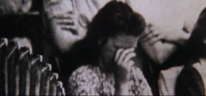 |
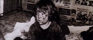
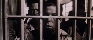
The romanticized or sentimentalized association between the idea of “Father” or “Mother” that was present in the first sequence now gives way to a different set of associations relating to poverty and a troubled home life. When this part of the film arrives at “Me,” the implications are even bleaker. “Me” is followed by a child, his face smeared with filth, and then an image of a young man in prison. Note how this brief sequence of images, through associative editing, creates a narrative of sorts: “Me,” as a poverty-stricken child will one day end up in jail.
 |
 |
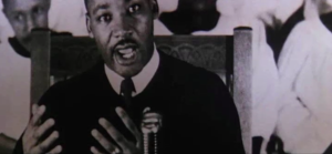
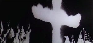
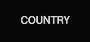
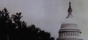
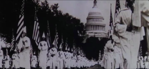
At this point, the pacing of the images accelerates and they cycle past the viewer almost too quickly to create any consistent set of meanings. Indeed, that is very much the point. The purpose of the film is to destabilize the usual associations one has with each of the displayed words. As different combinations are made by placing unexpected images in juxtaposition, the viewer begins to draw errant or uncomfortable associations. In one humorous example, the title card “Enemy” is followed by an image of a cheerleader, whereas that word had been previously linked to images of Adolf Hitler, Fidel Castro, and Chairman Mao. A more serious associative play soon follows. The title card “God” is juxtaposed first to a photograph of Rev. Martin Luther King Jr. and then to a burning cross at a Ku Klux Klan rally, demonstrating the use of religious both for the advancement of civil rights and the violent opposition to their advancement. “Country” appears next, followed by a photograph detail showing the U.S. Capitol Building, but this conventional association is twisted by the next image, this time the photograph in full, which depicts a KKK parade happening outside the Capitol.
 |
 |
 |
 |
 |
 |
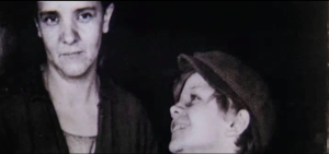
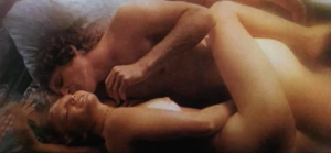
It is important to remember the historical context of Pakula’s film. Released in the early 1970s, the film makes many references to the social and political upheavals of the 1960s, including the civil rights movement and the assassinations of both political leaders (John F. Kennedy, Robert Kennedy) and civil rights leaders (Martin Luther King Jr., Medgar Evers). Its use (or misuse) of associative editing to scramble our standard conceptions of family, religion, and country is designed to make the viewer of the short film to feel as if their world has turned upside down, that they no longer recognize the America they once knew. For instance, after this sequence that purposefully confuses our sense of what “country” means or who our “enemy” is, the film suggests the breakdown of the family unit through an association of incest. First, it shows us stereotypical images of romantic and sexual intimacy between couples (preceded by the “Love” title card), but then, it reintroduces “Mother” immediately after. A photograph seen earlier of a child lovingly gazing up at his mother now takes on perverse associations. The grammar of the images appears to narrate an incestuous desire between mother and son, and then depicts the father as intervening to break up the Oedipal scenario.
 |
 |
 |
 |
 |
 |
 |
 |
 |
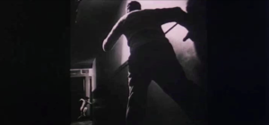 |
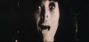
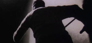
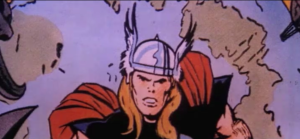
Why does the short film want to depict the breakdown of country and family? We should remember that this “test” is meant to either identify a potential assassin or create one. Thus, at it approaches its conclusion, a new set of associations are linked to “Me” whereby “Me” is figured as the hero-assassin who will restore order to a disordered America through violence. A quick succession of images subliminally suggest this course of action to the test subject: becoming an assassin will turn “Me” into the comic book hero Thor. And in fact, the short film concludes with a restoration of order. The pace slows, and each title card is again linked to stereotypical images as they were at the beginning.
 |
 |
This brief sequence from The Parallax View perfectly demonstrates (and exploits) how viewers constantly draw associations between successive images. This is the principle around which associative editing is organized since its aim is for viewers to infer conceptual or poetic links between juxtaposed shots. These shots are not linked by spatial or temporal relations. They are linked instead by ideas.

