Mise en scène
DEFINING MISE EN SCÈNE
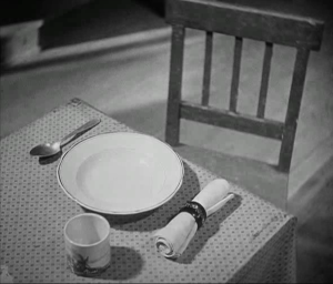
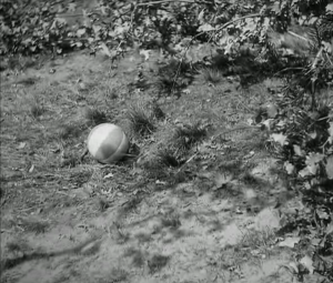
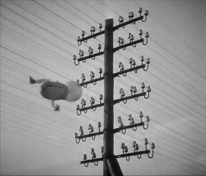
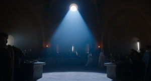
Here is an essential principle: the diegetic world of a film is not the real world. Reality is cinema’s raw material, since it makes use of real people and places to tell a story, but without exception filmmaking transforms actuality. This transformation can be minimal, where a film closely resembles real life, or it can be considerable, as in a fantasy film populated by imaginary beings and unreal places. What makes a film, like any other type of art, distinct from the real is its expressiveness. It invests the stuff of the real world – objects, gestures, actions – with meaning. They take on a newfound significance within the context of a narrative or in relation to a fictional character. For example, a chair in the real world may just be an unremarkable chair, but when German director Fritz Lang cuts to a shot of an empty chair around the modest dining table of Beckmann family in M (1931), he does so to indicate that the family’s young child Elsie won’t ever return home, having been killed by the film’s child murderer (Figure 1). Elsie is also linked to a child’s ball and a balloon, so when Lang wants to further indicate her disappearance, he shows the ball bouncing across the frame and the balloon caught among telephone wires (Figures 2-3). In this way, a chair, a ball, and a balloon all come to mean something more than they do on their own.
Film studies uses the term mise en scène (French for “to place within a scene”) to designate those aspects of film production involved in setting the scene or staging narrative action. It originates from theater and encompasses those elements which film shares with that art. Mise en scène therefore does not involve any cinematographic elements. It does not pertain to the act of filming (i.e. framing, camera movement, editing, etc., to be discussed in later chapters). Rather, mise en scène involves the preparatory work done to create a film scene before any camera makes it to set. In the industry, this entails the contributions made by production design, costume design, lighting technicians, and prop masters. In film analysis, mise en scène refers to the following aspects:
Setting, sets
Costumes and makeup
Props
Lighting
Figure movement
Staging or blocking
This chapter will discuss each of these in some detail, especially for their relevance to film interpretation. Before proceeding, though, what can be said about mise en scène in general? Mise en scène performs several functions in a film’s expressive creation of meaning. Resulting from the choices made by the director and other members of the crew, a film’s mise en scène does the following:
establishes the time and place of the narrative
reveals narrative information
establishes character traits
creates mood; and
develops thematic meaning
Mise en scène is specific to each film, and it involves a substantial number of decisions about how to build the narrative world of the film. What type of clothing would this character wear? What would their home look like? Should they be standing or seated when the scene begins, and should they move their position on set as it unfolds? Are the light sources going to be visible in the frame? Mise en scène comprises the sum total of choices made in the creation of a coherent and credible diegesis. Distinct from the real world, mise en scène is expressive (or full of meaning) because it is the result of intentional design. One goal of film analysis is to understand why certain choices were made over their possible alternatives. Why this setting and not this other one? Why does the actor gesture in this way and not that other way? What effect does this lighting choice have? How could this scene have been staged differently, and what meaning can we derive from the form it ultimately takes?
SETS, COSTUMES, AND PROPS
Films build the world of their characters. Whether the film is shot in a studio set or on location, and whether the film is realistic or fantastical, it creates as fully realized an environment as possible in which its action will take place. All of the decisions regarding sets, costumes, and props are intended to present a unified vision of what this world is like. The diegesis is most often designed to be internally coherent, even if it is unreal or imaginary. Inconsistencies or mistakes – such as the Starbucks cup that was visible on set in an episode of Game of Thrones (HBO, US, 2011-2019) before being digitally scrubbed from later broadcasts – can undermine this illusion of a self-consistent diegetic world.
Sets, costumes, and props provide an information-dense set of visual cues that are continually communicating to the spectator about character traits, narrative details, and thematic meaning. While films do relay information through dialogue, it is essential to remember that cinema’s primary means of expression is nonverbal. We come to understand who a character is, what their life is like, and what the features of their world are through these elements of mise en scène.
Sets
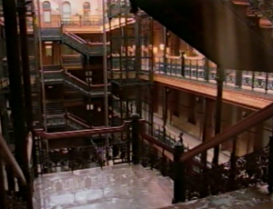
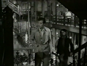
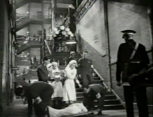
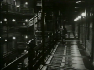
In the film essay Los Angeles Plays Itself (US, 2003), director Thom Anderson documents the use of Los Angeles as a backdrop to and location for the filming of movies. In one sequence, he highlights the various uses of the Bradbury Building, constructed in 1893, as a setting for Hollywood films (Figure 4), including the following: China Girl (Henry Hathaway, US, 1942), The White Cliffs of Dover (Clarence Brown, US, 1944), D.O.A. (Rudolph Maté, US, 1950), Indestructible Man (Jack Pollexfen, US, 1956), Marlowe (Paul Bogart, US, 1969), Blade Runner (Ridley Scott, US, 1982), Wolf (Mike Nichols, US, 1994), Murder in the First (Marc Rocco, US, 1995), and (500) Days of Summer (Marc Webb, US, 2009). Across these films, it served as a Burmese hotel (Figure 5), a wartime London military hospital (Figure 6), an import-export company, the site of a revenge killing (Figure 7), a detective’s office, a dilapidated ruin in the future (Figure 8), a San Francisco law office, a New York publishing firm, and an architecture firm (Figure 9). The cinematic life of the Bradbury Building indicates how the same location can be adapted for almost any diegetic purpose in film’s realization of fictional worlds.
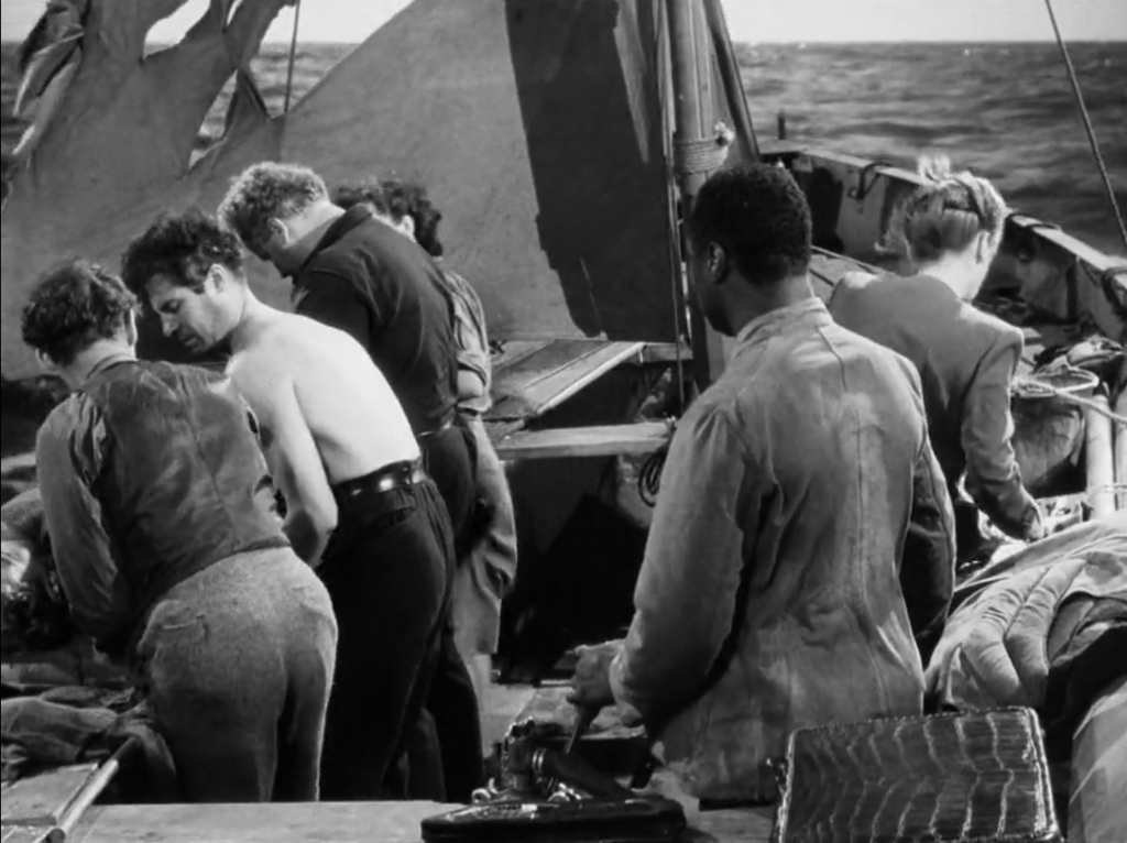
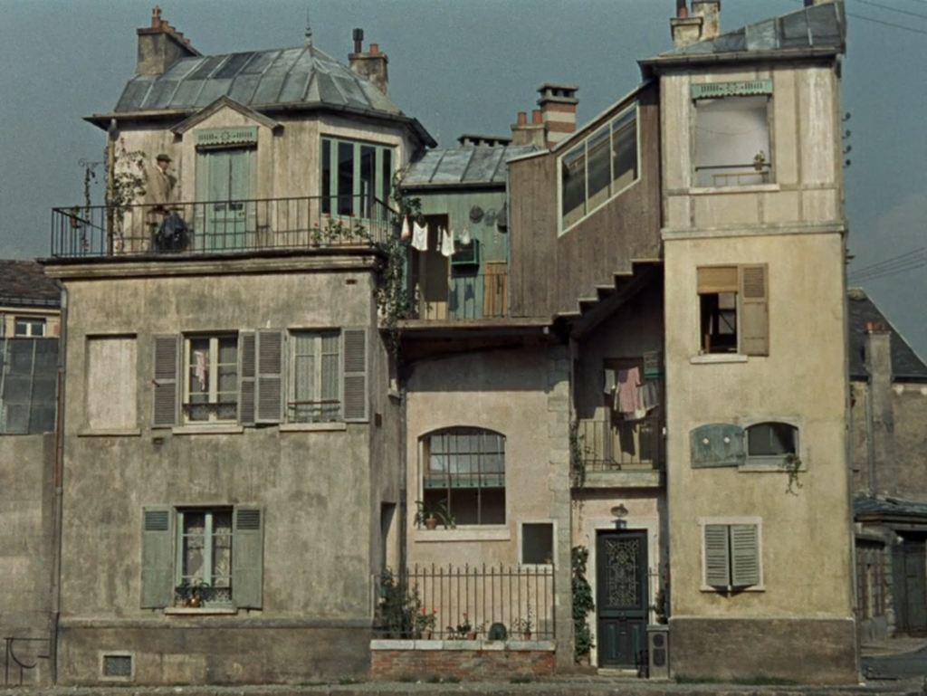
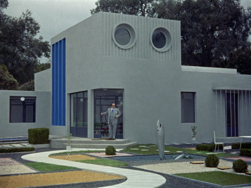
The function of setting is to credibly establish the time and place of the film’s narrative. It can highly restricted, limited to a single place, as in the small boat of Lifeboat (Alfred Hitchcock, UK, 1944) (Figure 10) or the telephone booth of Phone Booth (Joel Schumacher, US, 2002), or can be quite expansive, as in many elaborate sets created for Gone with the Wind (Victor Fleming, US, 1939). Beyond this referential function, which specifies film’s relationship to the real world, setting can take on thematic or symbolic meaning, or more simply, can be used as a means of visual juxtaposition. In Edward Scissorhands (Tim Burton, US, 1990), the pastel-colored, cookie-cutter suburban houses contrasts sharply with the gothic mountaintop mansion where Edward lives alone (Figure 11). Similarly, in The Wizard of Oz (Victor Fleming, US, 1939), the sepia-toned rural landscape of Kansas appears drab when compared to the fantastical and colorful world of Oz. The French director of droll comedies Jacques Tati made extensive use of sets to underline a thematic opposition between France’s traditional past and its modern future. In Mon Oncle (1958), the foppish Monsieur Hulot (played by Tati himself) lives in a shabby apartment building in the older sections of Paris (Figure 12). He is distinctively out of place when he visits his sister’s sleek, futuristic home, with its inscrutable (to him) modern appliances and minimalist décor (Figure 13).
Setting can express the transformations of a character over the course of a film. At the start of The Marriage of Maria Braun (Rainer Werner Fassbinder, Germany, 1978), set in postwar Germany, Maria (Hanna Schygulla) lives in a barely habitable apartment, with significant disrepair, including large holes in the walls. The building is surrounded by the rubble of the city from the wartime bombings. By the film’s end, she has risen to wealth and occupies a sizeable mansion, having achieved luxury she could not previously imagine. However, her last act is to destroy her home in a fiery gas explosion, set off by lighting her cigarette, killing herself and her husband. This self-destructive gesture is a perversely romantic one, borne of the desire to preserve an ideal image of her marriage rather than face the banal reality of it. The animated film Moana (Ron Clements and John Musker, US, 2016) similarly uses setting to establish a character’s arc. The first scenes of the film introduce the poor state of Moana’s island nation, as crops are turning rotten in the ground. Moana ventures to a new setting – into the open ocean – in search of a solution for her people. She successfully returns the “heart of Te Fiti,” a living island that has become a destructive monster, and once she does so, life is restored to the ocean and the islands. Moana’s courage in voyaging out into the new setting of the ocean ultimately healed the lands.
Costumes and Makeup
Like setting, costumes and makeup are used to reveal character traits, establish the time and place of the narrative, and develop thematic meaning. Some characters are defined by their distinctive costuming. What would Darth Vader be without his helmet, or Dorothy without her ruby slippers, or Indiana Jones without his fedora and brown leather jacket?
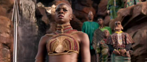
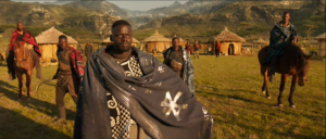
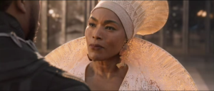
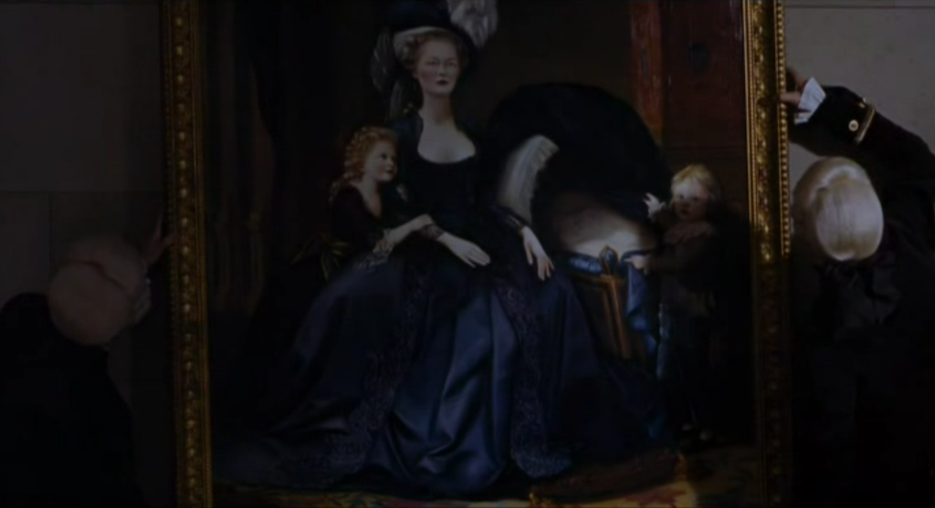
Costume, again like setting, has a referential function, designed to locate the diegesis at a particular historical moment. A historical drama such as Elizabeth (Shekhar Kapur, UK, 1998) features period costumes authentic to 16th century England during the reign of Queen Elizabeth I whereas Babylon (Damien Chazelle, US, 2022), set in early Hollywood, draws influence in its costume design from the styles of the 1920s. A TV show such as The Crown (Netflix, UK, 2016- ), which centers on the other Queen Elizabeth, spans decades across its seasons, and its costumes are updated accordingly to represent the shifting timeline of the program. Even costumes in fantastical worlds can have specific historical references. Ruth E. Carter, the Oscar-winning costume designer for Black Panther (Ryan Coogler, US, 2018), has said that the various looks created for Wakanda combine elements from African indigenous tribes with a futuristic design, especially since that hidden kingdom is presented as technologically advanced. Color choices, such as the extensive use of red, and various ornamentation, like neck rings and beadwork, are specific tribal references, while costume elements such as the intricate crown of Queen Ramonda (Angela Bassett) were 3D printed (Figures 14-16).
Costumes can not only define a character but also create distinctions between them. In Erin Brockovich (Steven Soderbergh, US, 2000), for instance, the sexy attire of the title character, played by Julia Roberts, is used to ostracize her from her new colleagues at a stuffy law firm. Similarly, in Legally Blonde (Robert Luketic, US, 2001), when Elle Woods (Reese Witherspoon) arrives at Harvard University to win back her ex-boyfriend, her sorority-girl outfits at first alienate her from classmates. In Snowpiercer (Bong Joon-ho, US, 2013), costumes mark the class divide on a post-apocalyptic train carrying the last remnants of humanity. The privileged classes at the front of the train wear brightly colored, luxurious items, while those at the rear appear in rags (Figure 17).
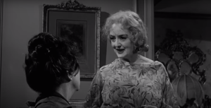
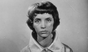
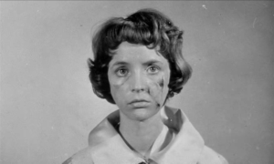
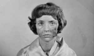
Makeup is an essential element in creating a believable illusion in the film’s manufacture of its fictional world. Its use goes unnoticed just as often as viewers recognize its presence. Apart from its beautifying function, makeup is used to fake wounds or scars, to artificially age an actor, or to create monstrous beings. In What Ever Happened to Baby Jane (Robert Aldrich, US 1962), Bette Davis plays an aging child star who cannot let go of her former fame. She is presented with pancaked white makeup on her face which, for her, is intended to evoke the doll-like appearance of her famous stage performance, but for the audience, makes her look grotesque (Figure 18). In Eyes Without a Face (Georges Franju, France, 1960), Christiane wears a featureless white mask to hide her disfigured face. To help her, her father abducts women and attempts to surgically graft their face onto his daughter’s. After one surgery, Christiane’s body rejects the new face, and make-up is used in a series of shots showing her face becoming necrotic (Figures 19-21).
Masks and prosthetics are a standard component of movie makeup, from the multiple rubberized masks used in the Mission: Impossible films, to the fake nose worn by Nicole Kidman to play Virginia Woolf in The Hours (Stephen Daldry, US/UK, 2002), or the “fat suits” worn by Eddie Murphy to play the members of the Klump family in The Nutty Professor (Tom Shadyac, US, 1996). What we call makeup in filmmaking really encompasses these types of practical body modification or transformation.
Props
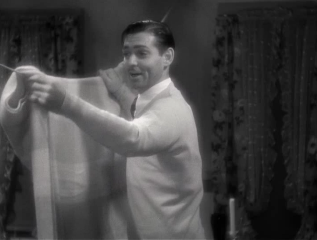
Props, short for “property,” refers specific objects of the set design with which a character interacts. As before, props serve a referential function, filling out the diegetic world of the film, but they can also be used in thematically significant ways. Take for example the “walls of Jericho” (Figure 22) in the screwball comedy It Happened One Night (Frank Capra, US, 1934). The nickname refers to a bedsheet hung between two motel beds in order to separate working class Peter Warne (Clark Gable) and society woman Ellie Andrews (Claudette Colbert). She has fled her engagement and needs his help, while he is a journalist after a good story, and though there is initially conflict between them, they are clearly fated to end up together. In the film’s final scene, when they return to the motel room as newlyweds, the “walls of Jericho” are knocked down, signaling their romantic union.
Props can sometimes be the central point of visual interest in a shot, typically because of their narrative significance or to act as a stand-in for a character. In one of the gags of Charlie Chaplin’s silent film comedy Modern Times (US, 1936), Chaplin as his famous tramp character – a figure recognizable through his use of costume and props – works as a waiter in a crowded dance hall. Tasked with bringing drinks to the patrons, he holds a packed tray above his head, but gets lost among all the dancers. The viewer only sees the tray bobbing over the heads of the dancers, shuffled about the floor. In the psychological thriller Suspicion (Alfred Hitchcock, US, 1941), the heiress Lina McLaidlaw (Joan Fontaine) suspects that the man she married may be trying to murder her for the life insurance money. In one scene, he carries a glass of milk up to her bedroom, but she refuses to drink it out of fear that he plans to poison her. Hitchcock shows him carrying the glass on a tray up the stairs to her room, and instructed his cinematographer to place a light in the glass, so that its low-level glow draws the viewer’s visual attention (Figure 23). In a similarly sinister use of a drink as a prop, in Get Out (US, 2017), director Jordan Peele features a dainty teacup – especially the quiet scrap of the spoon against the ceramic – as a tool for hypnotizing a black man visiting his white girlfriend’s secretly racist family. Commentary on the film also pointed to a late scene where his girlfriend eats Froot Loops in an odd way, eating them separately while drinking milk from a glass. This unexpected use of props is a visual sign of the segregationist views of the family, keeping the white of the milk separate from the colorful pieces of cereal.
When it was common for characters to smoke in Hollywood films, the cigarette became a prop that filmmakers could manipulate to express something about the relationship between characters. In a playful version of this, when Tracy Lord (Katherine Hepburn) knows that Macaulay Connor (James Stewart) and Liz Imbrie (Ruth Hussey) are tabloid journalists posing as wedding guests to report the gossip on her nuptials, she offers them both a cigarette from a metal case when they arrive. Liz takes one, but when Macaulay reaches for his, Tracy pretends to inadvertently withdraw the case, denying him one. Though Tracy appears to be the gracious host, the cigarette prop reveals her inner resentment at their presence. In the classic melodrama Now Voyager (Irving Rapper, US, 1942), the actor Paul Henreid famously lit held two cigarettes in his mouth, lighting them both and handing one to Bette Davis’s character, as an act of seduction. More somberly, in the film noir Double Indemnity (Billy Wilder, US, 1944), claims adjuster Barton Keyes (Edward G. Robinson) is routinely unable to find a match to light his cigarette, and his coworker Walter Neff (Fred MacMurray) will do it for him. At the end of the film, when an insurance scam Neff that attempts to pull goes badly, he lies shot, bleeding, and headed for the gas chamber for his crimes. This time, Keyes reaches over to light Neff’s cigarette. This gesture with the prop indicates their enduring friendship even amidst these tragic circumstances.
An Analysis of Sets, Costumes, and Props in Sofia Coppola’s Lost in Translation and Marie Antoinette
Writer-director Sofia Coppola has made 8 features since her debut film The Virgin Suicides (US, 1999). These films – including Lost in Translation (US, 2003), Marie Antoinette (US, 2006), The Bling Ring (US, 2013), and The Beguiled (US, 2017) – vary significantly in their historical settings and formal styling, but regardless of their differences, certain aspects of mise en scène – sets, costumes, makeup, and props – remain significant to Coppola’s approach to cinematic storytelling. This section will examine some connective threads in two of her films in terms of these aspects.
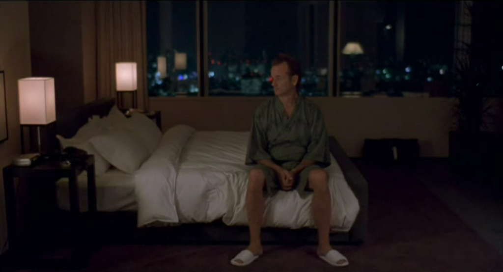
Coppola has said that she prefers to film in real locations as opposed to on studio sets. A primary setting in Lost in Translation is the Park Hyatt hotel in Tokyo, where the film’s two main characters are staying. In the film, an aging actor, Bob Harris (Bill Murray), establishes a friendship with a lonely young woman named Charlotte (Scarlett Johansson), whose husband frequently leaves her behind for his assignments as a photographer. Confronted with his fading celebrity and strained family life, Bob finds a kindred spirit in Charlotte’s sense of purposelessness. The hotel provides a suitable backdrop to their feelings of alienation. A hotel is a transitory space, a temporary residence for people passing through. It is designed to simulate the feeling of home without actually being anyone’s home. Coppola uses the hotel – its interchangeable rooms, its bar and lounge, and its lobby – to underline the feeling of rootlessness felt by Bob and Charlotte. The nondescript, “empty” character of the hotel corresponds to their sense of not knowing (or no longer knowing) who they are (Figure 24).
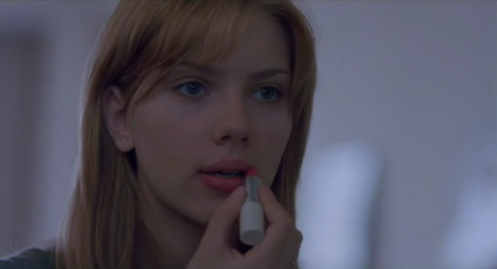
Indeed, the hotel at times seems to force them into self-examination. At one point, Coppola shows Bob watching one of his own TV appearances from earlier in his career and later, she frames him in the mirrored doors of the elevator. The first provides him a self-reflection of his former glory, if slightly absurd since he is shown co-starring with a trained monkey, while the second presents him with an image of his diminished status. Charlotte too is forced into painful confrontation with her own self. Coppola shows her applying lipstick, but withholds the mirror reflection from the spectator (Figure 25). Charlotte is consciously preparing herself to be seen by others, but it is clear that the world does not register her presence. When she and her husband encounter a famous actress in the lobby, they barely acknowledge Charlotte. She passes through different rooms of the hotel – hosting a press conference and a flower arranging class – with barely any notice from others.
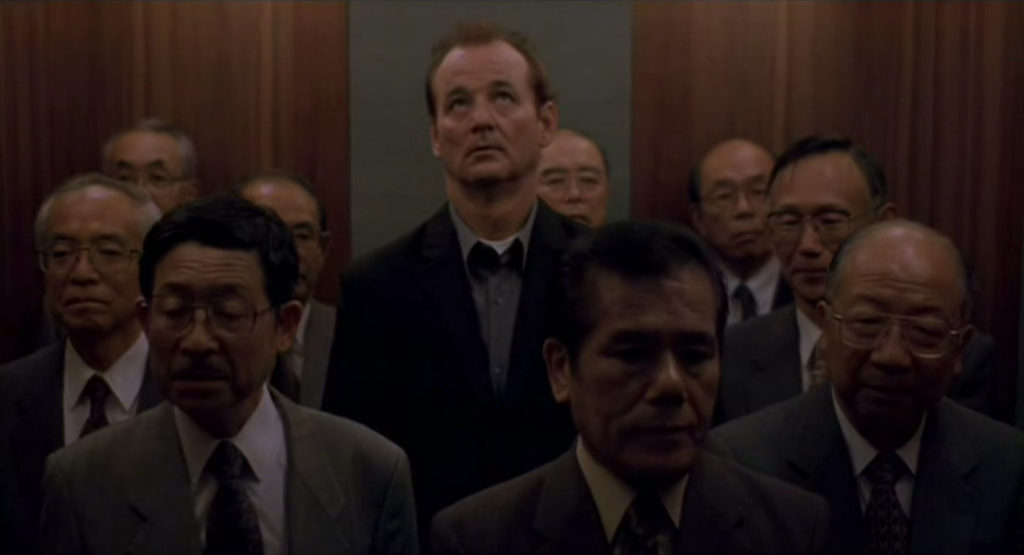
The sites outside of the hotel offer no respite for either character. Charlotte attends what she calls a “shrine” but feels ill at ease amongst traditional Japanese culture. More characteristic is Coppola’s repeated framing of her at the window of her hotel room, looking down at Tokyo’s cityscape. These images succinctly express the idea that Charlotte feels “walled off” from her surroundings. Bob too is presented in a visual juxtaposition to his environment, as seen in an early shot of him towering over others in the hotel elevator (Figure 26).
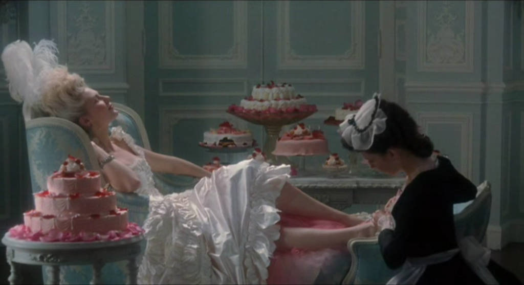
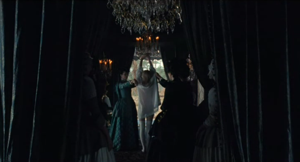
Just as Lost in Translation exploits the transitory space of the hotel to express the loss of identity of her central characters, her subsequent film Marie Antoinette gained unprecedented access to the palace at Versailles to narrate the life of France’s last queen, prior to her execution during the French Revolution. Coppola collaborated with production designer K.K. Barrett and costume designer Milena Canonero to recreate the ornate interiors and lavish dresses that characterized the lives of the French aristocracy of the time. Accurate period detail was a priority for the production. While the film could shoot exteriors and some interiors on days when the palace was closed to the public, other locations, such as the queen’s bedroom, had to be recreated with exacting detail. As Barrett indicates, the fabrics used for Marie’s bedding and her bedroom walls were precise reprints of the originals (Figure 27). Such detail was demanded by the importance of that location for establishing Marie’s sense of isolation as a new arrival to France. As set decorator Véronique Melery comments, “We knew there were going to be a lot of close-ups in the bedroom scenes so the amount of detail had to be immaculate. We wanted to recreate the feeling of this little woodland creature enveloped in a nest of luxury who still feels terribly lonely.” The “gilded cage” feel of the bedroom was designed to contrast with the queen’s chateau, the Petit Trianon, gifted to her by her husband King Louis XVI, whose natural garden spaces and voluminous white curtains captures Marie’s sense of freedom from royal protocols.
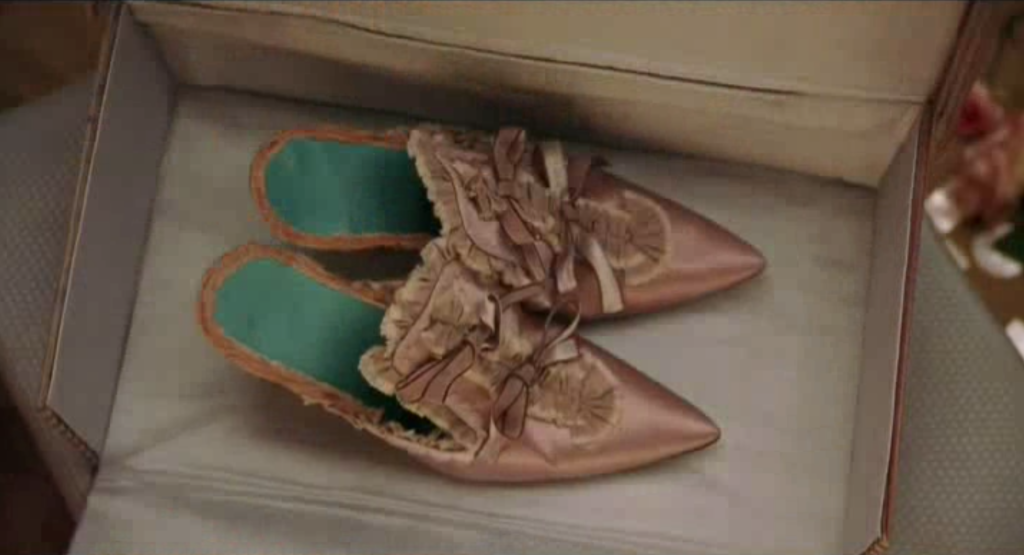
Even as period accuracy was important, Coppola insisted that the production design reflect a contemporary pop sensibility. Marie arrives to France a teenage girl who would be drawn to fun and frivolity, so Coppola dispensed with the stuffiness of a period drama in favor of a confectionary aesthetic (Figure 28). Indeed, the film’s pastel color palette was in part inspired by the macarons of a famous Parisian bakery. As much as the production crew adhered to a principle of historical accuracy, they were also encouraged to follow what Barrett calls a more “impressionistic” approach, allowing them to take liberties according to what they thought the Marie Antoinette of today would wear. Canonero created 70 original dress designs for Marie who, like her real counterpart, never wears the same outfit twice. Designer Manolo Blahnik was commissioned to create an entire line of shoes, which are prominently featured in a fast succession of close-ups set to Bow Wow Wow’s 1982 pop hit “I Want Candy” (Figure 29).
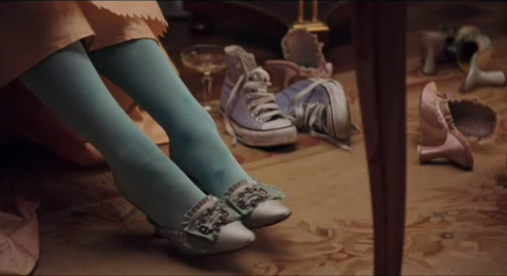
The anachronistic use of pop music on the film’s soundtrack also extends to elements of its production design. For example, a brief shot shows a pair of Converse sneakers among Marie’s belongings (Figure 30). What would otherwise be considered a mistake in the creation of a period-accurate diegesis serves instead as a surprising detail that reveals Coppola’s presentation of the young French queen as a modern-day fashionista. Indeed, Marie Antoinette’s opening shot recreates an image by fashion photographer Guy Bourdin, as if to announce at the outset that we should view this historical figure through a contemporary pop-cultural lens (Figure 31).
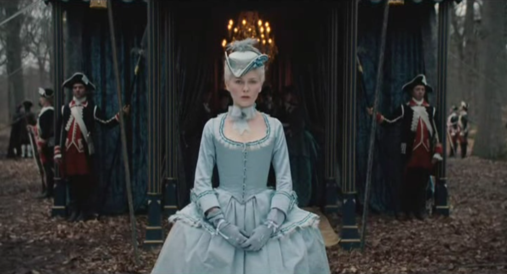
As in Lost in Translation, costume and set design is used to express character interiority. When Marie leaves her home in Austria to be offered for marriage to the future king of France, the film stages this moment of transition using these elements of mise en scène. The scene shows Marie arriving at a tent as she is greeted by representatives of the French court. In this tent, she is stripped of her clothing, not permitted to retain any mark of her Austrian identity. She is then dressed and emerges on the opposing side of the tent, her transformation into the French dauphine now complete (Figures 32-33).
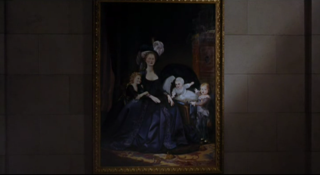
This scene is characteristic of how Coppola uses mise en scène, rather than dialogue, to communicate significant narrative events. In another example, the death of one of Marie’s children is indicated by means of a portrait. A painting of the family is taken down off one of the palace walls, and it is then replaced by an altered version, with one of the children now absent from the canvas (Figures 34-35). The viewer’s supposition about what this means is confirmed by the funereal dress worn by Marie in the next scene.
Coppola’s visually diverse films demonstrate how directors adapt their mise en scène to suit the subject matter of the film. The contemporary and minimalistic settings of Lost in Translation contrasts sharply with the luxurious exuberance of Marie Antoinette’s depiction of French royalty, yet both films explore themes of alienation stemming from the insulated lives of the wealthy and privileged. Her characters suffer from “golden handcuffs,” trapped in the malaise of luxury, but they also exhibit a youthful rebellion against these constraints.
LIGHTING
The word “photograph” derives from the Greek words for light (phōtós) and writing (graphê), so photography is a practice of writing with light. Film is a photographic medium, and therefore lighting is one of its most fundamental expressive tools. On a film set, the director of photography (or cinematographer) oversees the lighting set-ups of each scene. This section will outline many of the technical terms and formal conventions of lighting for film, as well as analyze some of its more expressive uses.
Natural Lighting. Natural or available light refers to the existing light within a location or commonly, available daylight (Figure 36). A director can make use of natural light exclusively (as in many exterior scenes), modify it (through shading an area or using a reflector to bounce light onto the actor), or supplement it with artificial lights. Using available light offers the cinematographer less control but it will often be justified by the scene or overall aesthetic look of the film. Some may be familiar with golden hour referring to a brief period of twilight that occurs at dusk that offers ideal conditions for filming since it provides a soft and aesthetically pleasing luminosity (Figure 37).
ASPECTS OF ARTIFICIAL LIGHTING
Placement. Lighting placement refers to the direction of a shot’s primary light source in relation to the subject/object being illuminated.
Top. In top lighting, the primary lighting source is located above the subject. (Figure 38)
Under. In under lighting, the primary lighting source is located below the subject. (Figure 39)
Side. In side lighting, the primary lighting source is located to the left or right side of the frame. (Figure 40)
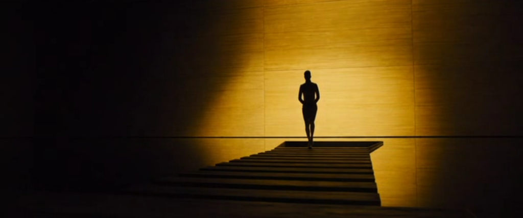
Back. In back lighting, the primary lighting source is located behind the subject. The typical effect of backlighting is to silhouette the subject. (Figure 41)
Frontal. In frontal lighting, the primary lighting source is located directly in front of the subject. (Figure 42)
Quality. Lighting quality refers to the intensity of illumination. It is standard to distinguish between hard and soft lighting. Hard lighting is a bright illumination, often producing a stark contour on the illuminated object (Figure 43). Soft lighting is a diffuse illumination, producing less distinct edges. Candlelight and firelight are recognizable uses of soft lighting (Figure 44).
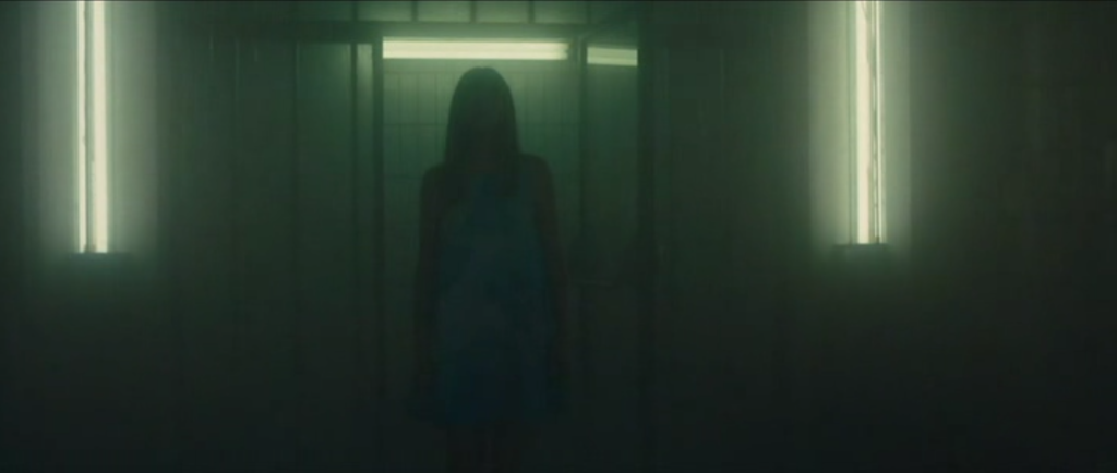
Color. Through the use of filters or gels, cinematographers can vary the hue of a lighting source. Colored lighting can be a feature of a mise en scène that is non-naturalistic, involving an intentional deviation from verisimilitude (Figures 45-46).
In contemporary film production, practical lighting on set is used in combination with a post-production process called color grading. Color grading refers to the manipulation of the image to create an overall consistency to its color palette and their tonal qualities, regardless of whether the final look corresponds to its appearance on set. The “orange and teal” look, for example, is a frequently used color combination asked of color graders for contemporary film and television (Figure 47-48). This aesthetic tends to be pull most skin color and lighting sources toward the orange side of the spectrum, while pushing shadows and background elements toward the blue side. The result relies on a visually pleasing contrast between complementary colors, while emphasizing the narratively significant elements in the frame, but it has been used often enough that, to many viewers, now has the feel of a visual cliché.
TYPES OF LIGHTING SOURCES
Key light. A key light designates a shot’s primary light source. It provides the brightest source of illumination.
Fill light. The fill light is a secondary source of illumination that functions as a complement to the key light. Typically placed at an opposing angle to the key light, its purpose is to moderately brighten the shadows created by the key – for example, by providing some illumination to the other side of an actor’s face from the side lit by the key.
Back light. A back light is used to separate the primary object of illumination – most often, an actor – from the background. On a person, a back light produces highlights at the top of the head and along the shoulders that create a subtle but perceptible halo illumination that “pops” the figure away from the background. Backlighting as defined above involves a setup where the back light functions as the key light.
CONVENTIONS OF ARTIFICIAL LIGHTING
Classical form in Hollywood filmmaking developed a standardized approach to film lighting involving stabilized arrangements of lighting sources. This approach is called three-point lighting, since it is an arrangement of key, fill, and back lights. It contributes to the appearance of roundedness or volume to the image, so that what it depicts seems to exhibit a sculptural depth rather than a planar flatness. An intentional use of lighting to create volume is one way to distinguish between amateur and professional photography. Film analysis tends to distinguish between two types of three-point lighting:
High key lighting. This lighting setup specifies a balanced relationship between key, fill, and back lights. It is recognizable by a low contrast between light and dark areas of the frame, meaning that shadows are tempered by the fill and back. High key does not mean brightness. It can be present in low-lit conditions. It has to do with the relative measure between the three light sources (Figure 49).
Low key lighting. This lighting setup specifies an unbalanced relationship between key, fill, and back lights. The presence of fill and back lights can be minimal or even absent. It is recognizable by a high contrast between light and dark areas of the frame, creating areas of brightness and areas of deep shadow (Figure 50).
EXPRESSIVE USES OF LIGHTING: The Case of Roger Deakins
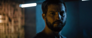
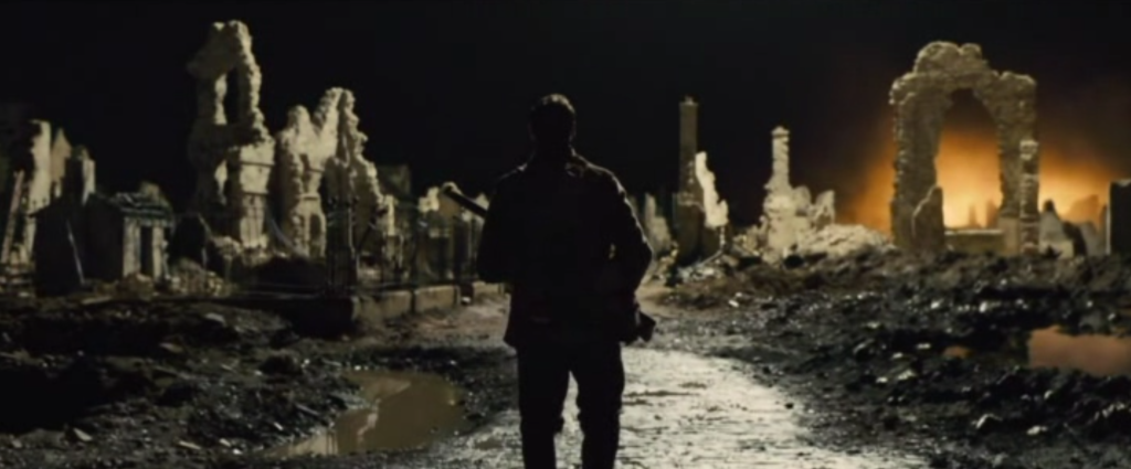
Roger Deakins is a 16-time nominee and 2-time winner of an Academy Award for Best Cinematography. His career as a feature-film cinematographer began in the late 1970s, and in the many decades of his Hollywood career, he has collaborated frequently with directors such as Ethan & Joel Coen, Sam Mendes, Edward Zwick, Norman Jewison, and Denis Villeneuve. This section aims to highlight some of Deakins’ work as an example of expressive lighting in film, referring to lighting that is more than just referential (designed to correspond realistically to the diegetic space). Expressive lighting characterizes lighting choices where illumination functions as an autonomous design element of shot composition. It is lighting that is more “noticeable,” especially because it is tied to narrative or thematic meaning. Whether Deakins is shooting a 19th-century western (The Assassination of Jesse James by the Coward Robert Ford [Andrew Dominik, US, 2007]) or a dystopian tale set in the future (Blade Runner 2049 [Denis Villeneuve, US, 2017]), there are recognizable continuities across his work.
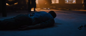
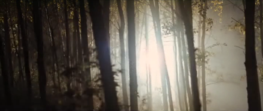
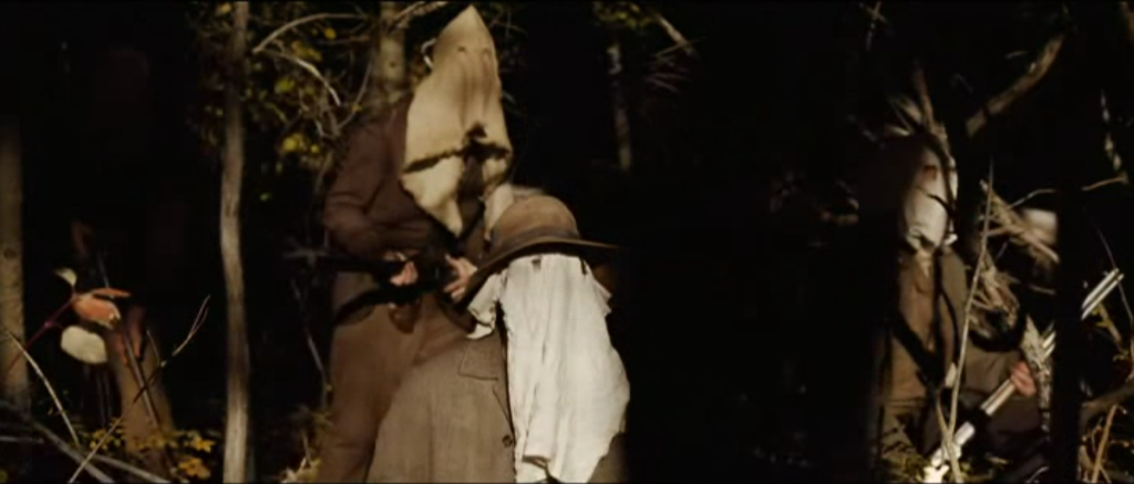
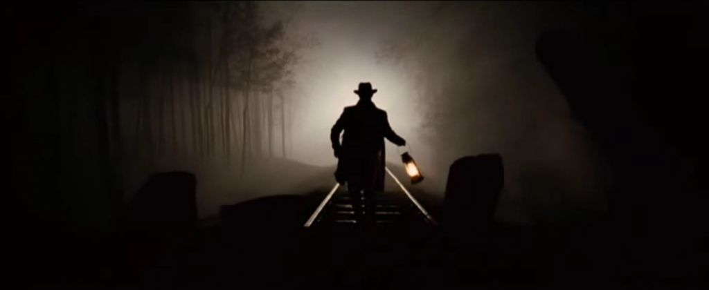
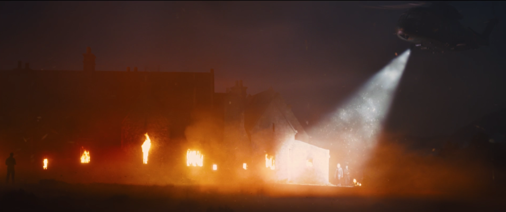
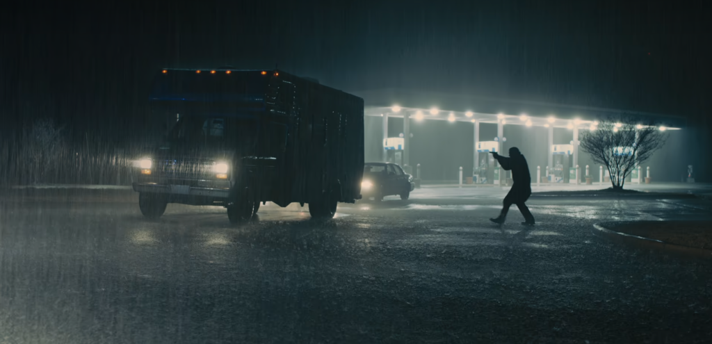
One recurring trait involves his use of light to suggest the presence of offscreen action. In the WWI drama 1917 (Sam Mendes, US, 2019), for example, as the protagonist passes through a bombed-out French city at night, enemy flares threaten to give away his presence (Figure 51). Deakins uses extremely bright overhead lights that starkly illuminate portions of the frame and then disappear, simulating the way a flare would pass across the sky. Likewise, in Assassination of Jesse James, when Jesse James (Brad Pitt) and his associates undertake a train heist, Deakins simulates the passing train with a travelling spotlight whose strong beams cuts through trees, picking up the masked faces of the robbers as it moves (Figure 52-53).
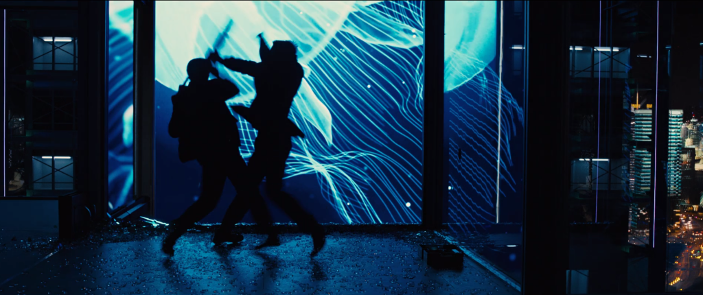
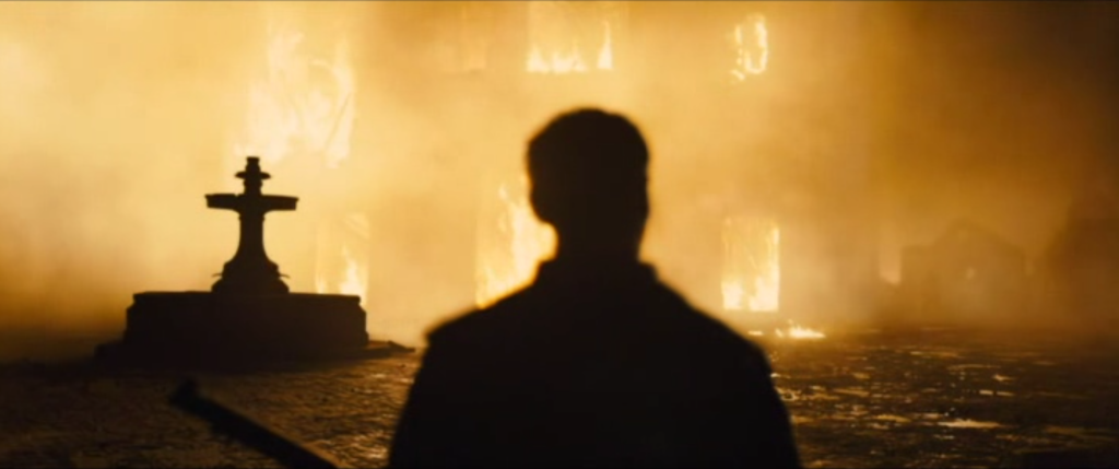
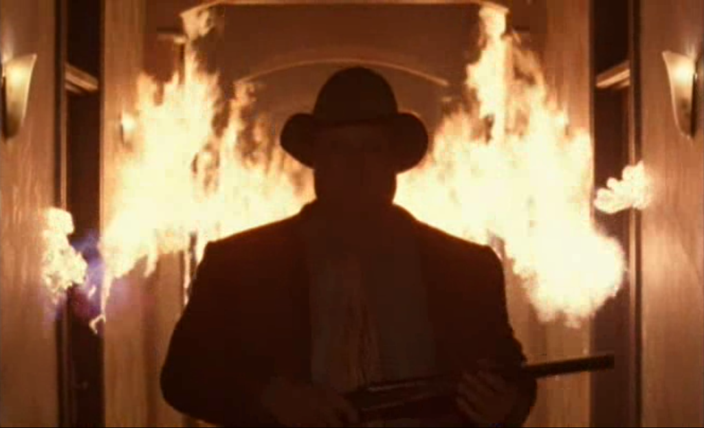
Another consistent trait is Deakins’ repeated use of backlighting, especially against a strongly illuminated backdrop or diffuse (and often colored) atmospheric light (Figures 54-57). In more than one instance, Deakins stages characters against a fiery background – meaning one literally consumed in flames. Similarly, these scenes tend to feature acts of violence, and therefore these lighting choices have the effect of theatricalizing brutality or giving violence a grandiosity that it may not have in other films.
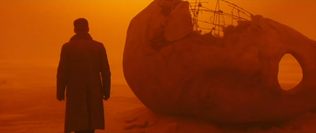
Deakins exploited the use of atmospheric light of different hues to significant effect in Blade Runner 2049. The film is a sequel to the 1982 Ridley Scott film Blade Runner, which used film noir lighting in a futuristic setting. In updating the world, Deakins created a vision of the future defined by dark interiors and exteriors that seem toxic in appearance. The film’s status as a science fiction film licenses its often non-naturalistic use of lighting that does not seem “realistic” or “practical,” but are effective in evoking a pervasive sense of gloom (Figures 58-61).
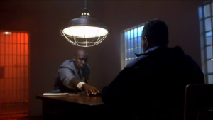
One final trait is Deakins’ reliance on primary spotlights, particularly to direct attention to a portion of the frame (Figures 62-63). These lights are sometimes strongly motivated (justified by the mise en scène, as when they are tied to the headlights of a car) and sometimes not, being “unrealistic” within the space. Given the violent themes of many of Deakins’ films as a cinematographer, these dramatic spotlights often create low-key lighting set-ups that maintain the dark, somber tone of the film at large.
Especially mordant is this use of lighting in Fargo (Coen Brothers, US, 1996) (Figure 64). After passersby witness the murder of a police officer, the killers give chase in their case. The car they are following loses control and flips over on the roadside. The scene is lit only by the beams from car headlights, which pluck out from the darkness the witnesses who were fleeing for their safety. The spotlight offers the palpable feeling that they are caught, and sure enough, each is one is murdered under cover of near-darkness.
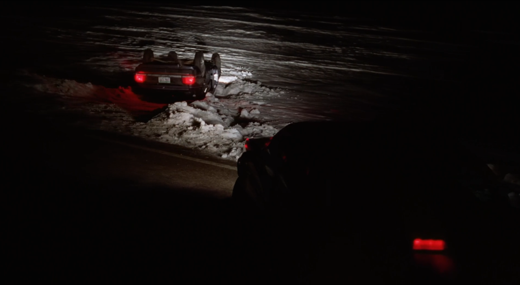
FIGURE MOVEMENT
Figure movement refers to the physical aspects of a body in the frame and the possible range of its movements insofar as they used for the creation of meaning. What is meant by a “figure” is an expressive body, which moves in intentional or purposeful ways. This is most often the body of an actor, but not always, since contemporary filmmaking is populated with digitally created entities, such as Luxo Jr., the humanistic lamp that viewers will recognize from the Pixar logo, which although it is an ordinary object, nonetheless moves in a recognizably expressive manner.
Figure movement encompasses the qualities of a body (size, shape, plasticity), its gestures and facial expressions, and the qualities of its movements (slow/fast, graceful/clumsy, energetic/fatigued, etc.). Figure movement therefore overlaps significantly with acting, since most of the time it aims to describe what choices actors make about their bodies. However, it is important to keep them distinct for at least two reasons. First, figure movement does not address all aspects of acting, such as an actor’s vocal qualities and line delivery. Second, “figure” is not identical to “character,” since it includes extras (background actors), dancers, and non-human digital animations. Figure movement pertains more to the treatment of the body as a visual element in the frame.
Qualities of the Body: Size, Shape, and Plasticity
The silent film classic Nosferatu: A Symphony of Horror (F.W. Murnau, Germany, 1922) introduced the vampire to cinema through the character of Count Orlok (Max Schreck). In order to emphasize the character’s otherworldly quality, Murnau created purposeful symmetries between the body of the actor and the architecture of Orlok’s castle. The curves of his back and his hunched shoulders were made to align with the sets, following the shape of a doorway or the curvature of an archway (Figure 65). In this way, the figure becomes part of the visual design of the image.
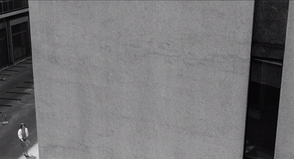
Another way filmmakers approach this is through a contrast of size or shape in the frame. When Michelangelo Antonioni wanted to underline the alienation of modern life, as he did in La Notte (Italy, 1961), he tended to position his actors in ways where the architecture of the urban environment would dwarf them (Figure 66). We mentioned another example of this earlier, when we pointed to the contrast in heights between Bill Murray and the Japanese background actors in an elevator in Sofia Coppola’s Lost in Translation. Similarly, when Sergei Eisenstein wanted to underline the oppression of the peasants by a class of wealthy farmers (known as kulaks), he used a size difference between characters in order to express that idea.
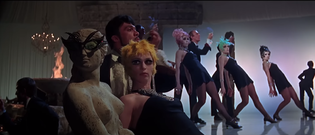
Plasticity refers to the ability of the body to bend, stretch, twist, or otherwise contort itself for expressive purposes. This is common in animation, where characters transform spontaneously, and in comedy, where clownish figures (think Charlie Chaplin, think Jim Carrey) make their bodies malleable for whatever the joke demands. We could also point to the use of the plasticity of the body in dance – for examples, in the films of director and choreographer Bob Fosse. In Sweet Charity (US, 1969), Fosse stages a dance number, called “the Rich Man’s Frug,” in a chic Italian nightclub; his dancers strike unusual and unexpected poses throughout in ways meant to invoke the exclusive atmosphere of the club (Figure 67). Similarly extravagant poses of the body can be seen in Fosse’s film version of Cabaret (US, 1972), which stars Liza Minnelli as a nightclub dancer in Weimar Germany. In both these cases, the body is called upon to assume an elegance and grace beyond its normal comportment.
Gesture and Facial Expression
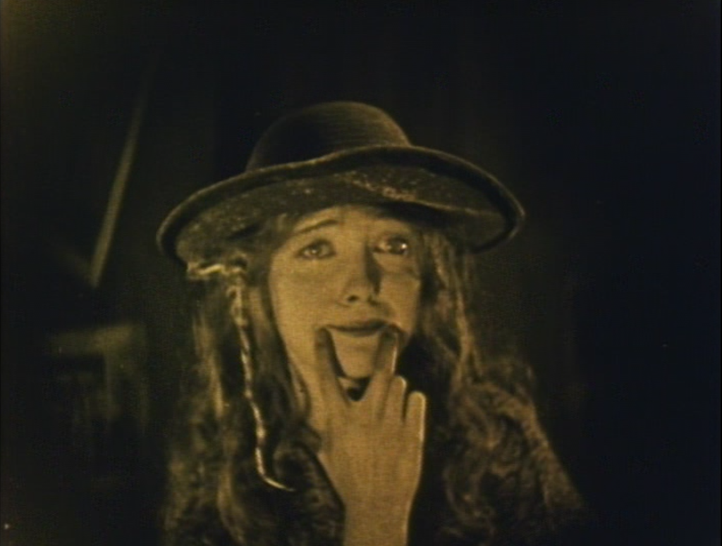
In D.W. Griffith’s silent melodrama Broken Blossoms (US, 1919), Lillian Gish plays a young waif known as “the Girl,” who suffers terrible abuse at home at the hand of her father Battlin’ Burrows (Donald Crisp). Having lived so tragic a life, when Battlin’ demands that she smile, Gish executes a profoundly pathetic gesture: she pushes up the corners of her mouth with her hand in order to present the smile she cannot naturally produce (Figure 68). Gish’s exaggerated gesture and facial expression indicates how these elements of performance can enhance the meaning of a film.
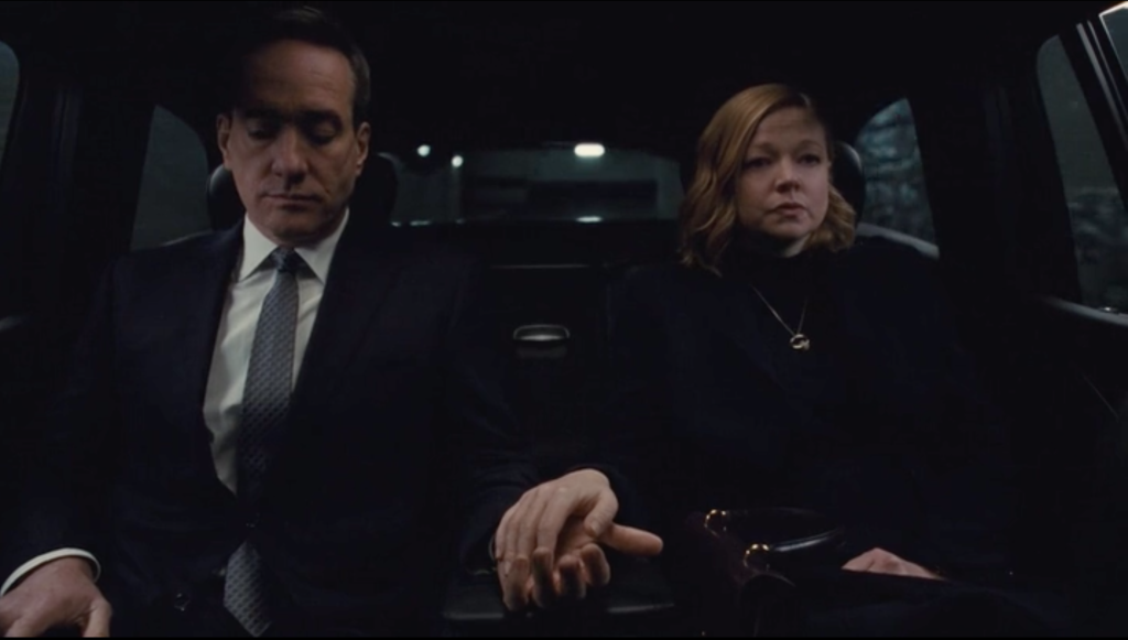
Often, rather than dialogue, it is these elements that reveal character interiority – what a character is feeling or thinking. When, for example, in Little Women, Jo March is negotiating to sell her first short story, a close-up shows the nervous fidgeting of her hands, indicating her lack of self-assurance in a way that her spoken dialogue does not. Similarly, when in HBO’s Succession (US, 2018-2023), Shiv Roy (Sarah Snook) and Tom Wambsgans (Matthew McFayden) resume their marriage after a highly acrimonious divorce, this potentially romantic moment is wholly undercut by a single gesture, as Wambsgans places his hand over hers, but in a cold, detached manner (Figure 69). They are barely holding hands, suggesting that although their relationship has started anew, it will be an empty version of its previous form.
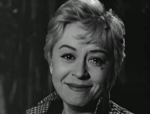
It is important to recognize the interpretive flexibility of a gesture or facial expression. The expressive movements of the body often carry a density of meaning that descriptive language cannot match. Consider one of the most enigmatic smiles in the history of film, the one performed by actress Giulietta Masina at the end of Federico Fellini’s Nights of Cabiria (Italy, 1957). Masina plays Cabiria, a prostitute who dreams of a better life. When she meets Oscar, that good life seems possible. He proposes, and she sells her small house for a dowry, but when she meets up with Oscar at a seaside cliff, he takes her money and leaves her destitute. Lacking money, a home, and love, Cabiria walks through a forested area, where young revelers form a spontaneous parade around her, playing music and dancing. Ever so briefly, she looks into the camera, her mascara running, her eyes welling with tears, and she smiles (Figure 70). What could this smile mean for a woman who has lost everything? Is this happiness? We could suggest that, despite all her hardships and her uncertain future, Cabiria is still able to recognize the simple joys of being alive. Her smile is a small triumph in the face of tragedy.
Qualities of Movement
Quality of movement refers to the mood or affect of the way something moves within the space of the mise en scène. How an actor walks, for instance, can vary significantly. She can saunter, amble, parade, skulk, prowl, stride, strut, or swagger. Being able to recognize and describe these differences is to be attentive to how figure movement can produce a range of meanings. In the German Expressionist film The Cabinet of Dr. Caligari (Robert Wiene, Germany, 1920), the evil Dr. Caligari hypnotizes Cesare to murder while sleepwalking. The actor portraying Cesare (Conrad Veidt) utilizes a jerky, non-naturalistic style of movement to express the deranged mental state of his character (Figure 71).
The quality of movement can change depending on the genre, even for the same action. Take the example of a death scene. In the film Buffy the Vampire Slayer (Fran Rubel Kuzui, US, 1992), actor Paul Reubens plays the vampire Amilyn, who when stabbed in the heart by Buffy (Kristy Swanson), dies in a comically exaggerated manner (Figure 72). He falls and then rises again into the frame, then stumbles around on his knees, and playfully kicks the wall before collapsing. This death scene is well suited to the light-hearted tone of the film. By contrast, when filming Schindler’s List (US, 1993), director Steven Spielberg had specific instructions for the actors playing Jews killed by Nazis. When shot, the actor would fall immediately to the ground. In distinction from the dramatized deaths seen in Hollywood films, Spielberg wanted a particular quality of movement to underline the brutality of the action.
STAGING
Staging (or blocking) refers to how a film positions bodies in relation to the sets and to each other. It involves a scene’s choreography of movement, as specified by directors in collaboration with their actors. If we can say that each shot has its initial conditions – the placement of the actors when the shot begins – then staging describes what changes take place to these initial positions over the duration of the shot or scene. Are characters grouped in particular arrangements? Is one visually isolated from the others? Does a character enter or exit the scene? What movements or changes of position do the actors execute? In classical form, staging is closely keyed to the dramatic logic of the scene, or put differently, what we are interested in when analyzing staging is not incidental movement but changes in blocking that have narrative significance (i.e. that are meaningful).
While in the abstract staging can be separated from framing (to be discussed in the next chapter), in practice the two are closely related, since figures are arranged with an understanding of how they will be framed for the spectator. We can name this relation between staging and framing composition. Shot composition, though unique to each film, has recognizable conventions that are routinely deployed by filmmakers. What follows are some conventions or broad parameters around which we can classify shot composition.
Naturalistic vs. stylized
A naturalistic composition describes an informal arrangement of figures in an environment (Figures 73-74). The shot does not feel too composed or too artfully arranged. It could be said to be more “realistic,” but realism is a tricky concept; nonetheless, a naturalistic shot will have a strong verisimilitude (resemblance to reality). Note that naturalistic does not mean “nature.” Location shooting or shooting in exteriors tends to be more naturalistic, since there are more uncontrolled elements in that environment than in a studio, but interior locations, studio sets, and entirely unreal computer-generated environments can still be naturalistic.
A stylized composition, by contrast, involves a formal arrangement of actors and sets within the frame (Figures 75-77). While both naturalistic and stylized compositions are intentional, a stylized image is more precisely controlled, tending to place its figures in recognizable patterns or according to a predetermined design, even if that choice of staging is “unrealistic.”
These two classifications function as opposing poles on a spectrum of possible shot composition, where, for example, the films of John Cassavetes might lie at one end and the films of Wes Anderson might lie at the other. It would not be possible to say where one tips into the other, and where any one shot falls on this spectrum is, to a degree, a matter of the viewer’s judgment. It is important to remember, moreover, that shot composition can vary across this spectrum within a single film. Consider, for instance, the final shot of the season-three finale of Succession. The overall style of the TV series tends toward naturalistic compositions, especially as its roving camera and frequent zooms do not permit any one shot to stabilize into a stylized composition (Figure 78). However, at the conclusion of season three, as the three siblings of the Roy family face the devastating prospect that their father plans to sell the media empire that is their birthright, director Mark Mylod depicts the moment of their shared misery in what has been described as a composition evocative of Renaissance art.
Shallow space vs. deep space
Any image has three dimensions. Its height and width are determined by the frame, and filmmakers can make choices about figure placement along these two axes – for example, by deciding to place an actor’s face at the center of the frame or pushed to one side, either left or right. The third dimension of an image is its depth. Of course, a film image, like a painting, is only two-dimensional, projected onto a flat screen, but the camera’s optical lenses reproduce images that adhere to linear perspective (a visual system that maintains relations of proportional size to create the illusion of volumetric depth). Linear perspective therefore gives the image its appearance of depth.
Staging involves the placement and movement of figures along these three dimensions (height, width, and depth). Shallow space composition refers to a type of staging that minimizes depth cues, orients itself along two dimensions, and features lateral blocking, or the horizontal arrangement of figures (Figures 79-80).
Deep space composition refers to staging in depth, involving the orchestration of narrative action along three dimensions (Figures 81-82). In distinction from the lateral blocking of shallow space composition, deep space composition frequently orients its figures or action along diagonals or circular arrangements that drive the viewer’s eye from the foreground to the background.
Balanced vs. unbalanced
This principle of composition assesses the relative distribution of figures within an image. It is more or less synonymous to whether an image is symmetrical or asymmetrical. In a balanced composition, figures and elements of the setting are “weighted” equally either along a left-right axis or top-bottom axis (Figures 83-84).
In an unbalanced composition, elements of mise en scène are typically grouped or arranged in only one section of the image, leaving other sections relatively unoccupied (Figures 85-86).
Another way of evaluating this aspect of composition is to consider a shot’s center of visual interest, defined the main point of visual attention within a shot. A shot featuring a single character likely has one center of interest, and it can be placed in the middle of the frame (balanced composition) or to one side (unbalanced composition). A shot, however, can have two centers of visual interest – for example, two characters facing off against each other, or a character standing before an object of narrative significance. A balanced composition would grant these centers of visual interest equal weight within the image, while an unbalanced composition would favor one over the other in terms of its visual prominence.
Dense vs. rarefied
This principle of composition is essentially an evaluation of the relative “emptiness” of an image. In visual art, negative space refers to the empty space surrounding the main figure in a drawing. It is the ground against which a figure stands out. Although a film image cannot be “empty” in the same way, a rarefied image is one that makes extensive use of negative space, surrounding its figure(s) with a relatively open or sparse mise en scène (Figures 87-88). By contrast, a dense mise en scène fills the space, crowding the frame with set elements, props, and/or figures (Figures 89-90).
ANALYZING MISE EN SCÈNE
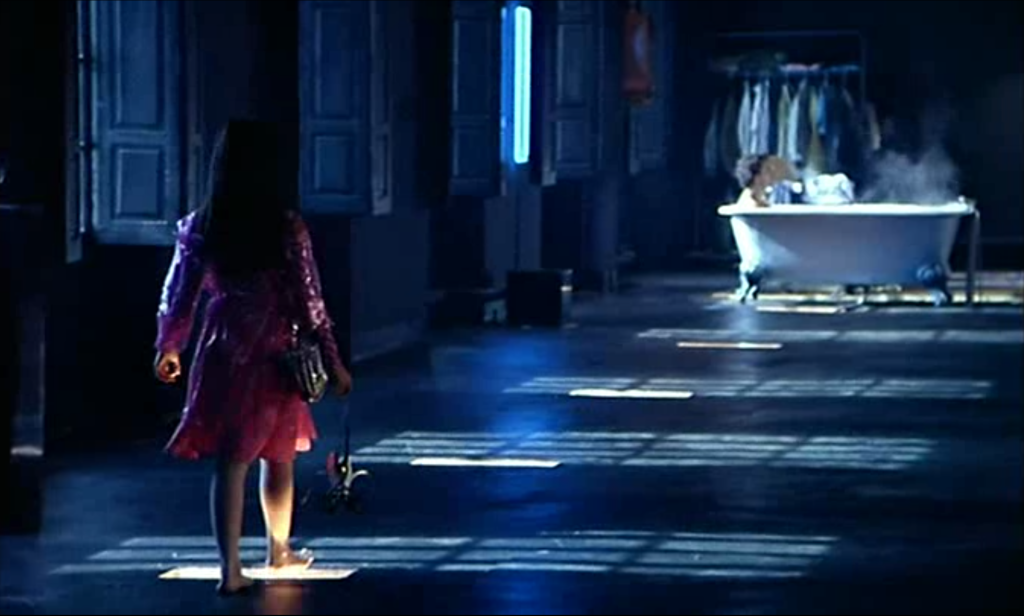
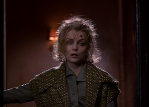
In order to demonstrate how films create meaning by utilizing the elements of mise en scène, let’s take a look at a scene from director Tim Burton’s superhero film Batman Returns (US, 1992). This scene is part of a villain origin story, showing the transformation of mild-mannered executive assistant Selina Kyle (Michelle Pfeiffer) into Catwoman. In the preceding scene, businessman Max Shreck (Christopher Walken) pushed Selina out of a skyscraper window after she discovers the corrupt intent of his proposed power plant. Miraculously, she survives the fall and returns home to her apartment, the starting point for our scene. Almost entirely lacking in dialogue, this scene shows Burton’s near-total reliance on visual means to depict the transformation of the character.
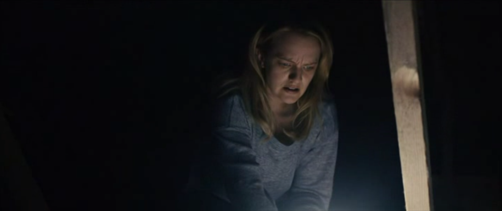
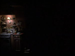
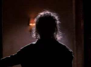
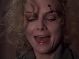
The first shot sets an expectation for Selina’s entrance (Figure 91). Lit by a single light over the stove, the image’s low-key lighting and unbalanced composition leaves ample negative space at the right side of the frame that anticipates the opening of the door. Once open, a figure is visible in its frame, paused at the threshold (Figure 92). It is recognizably Selina, but on account of the backlighting, her physical state and mental state of mind is initially withheld. She drops a cat, presumably not her own nor the first that will be present in the scene. In a closer framing, she reaches for a light switch, and in this high-key set-up, we register the expression of shock on her face and the wound on her forehead (Figure 93).
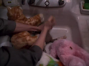
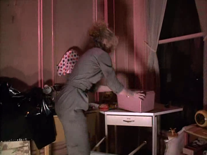
Now entering the apartment, it is apparent from her distracted and wearied movements (dropping her keys, knocking over a lamp, letting her jacket fall to the floor) that she is not fully herself. The prop of the milk further tightens the association between Selina and cats. She pours it haphazardly into a bowl for the cat, and then takes a drink from the carton, allowing it to pour down her face just as it splashed on the floor. This messy and scattered behavior contrasts sharply with the film’s earlier presentation of Selina as fastidious and tidy, if soft spoken and meek.
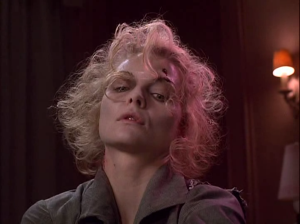
The scene fast arrives at her breaking point. Voicemails – or answering machine messages, in the parlance of the day – from her mother suggest that maternal disapproval is routine. The perfume advertisement initiates her breakdown, since it recalls her boss’s violent assault, particularly at the mention of Shreck’s department store. The moment of her psychological break initially appears as a look of agitation and a sharp intake of breath. It is clear that she is disturbed listening to the advertisement. It culminates in Pfeiffer’s tense gesture toward her face, her anguished scream, and the violent throw of the milk carton. What follows are a series of violent actions (Figures 94-96).
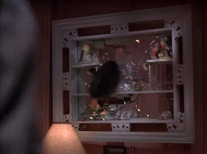
Selina destroys stuffed animals in her garbage disposal, uses a frying pan to smash her walls and a hanging mirror, and spray paints her wall and items in her closet. It is a scene of destruction, the tearing down of her former self. Selina’s apartment is a cutesy space, its walls painted pink and filled with juvenilia like the stuffed animals and the kitty cat tee shirt. Insofar as this home is a reflection of her personality, it indicates naivete and psychological repression (a consequence of her disapproving mother?). The smashing of the mirror is the scene’s most direct sign that Selina is leaving behind who she once was. As she undertakes this sudden transformation, the color palette of the space shifts from pink to black, the latter to be associated with her new persona of Catwoman.
After tearing down Selina Kyle, this scene presents the fabrication of Catwoman. Selina pulls a vinyl raincoat from her closet and brings it to the sewing machine in her craft room. In addition to breaking a dollhouse, repeating in miniature what she is doing to her own home, she knocks over a nearby lamp, an action that justifies the use of underlighting in these shots. The flipped orientation of this non-naturalistic lighting is an expression of her psychological disturbance (Figure 97). Her “crazed” mental state is also reflected in her facial expression as she sews: her head tilted back, her eyes wide open, and her mouth contorted (Figure 98). Pfeiffer used a similarly deranged expression when destroying the stuffed animals.
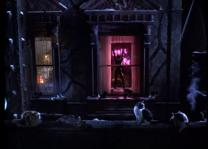
All the while, the presence of cats in the apartment continues to grow, and as the scene nears its conclusion, Burton incorporates shots taken from outside of the apartment building looking in. The introduction of this new space will figure the arrival of Catwoman. The apartment had been Selina’s space. Catwoman occupies the space of Gotham City at night. Accordingly, the scene’s final shot repeats the staging of its first: with Selina, now outfitted as Catwoman, her transformation complete, standing in the threshold of a doorway. Rather than arriving home a broken woman, she prepares to leave, having remade herself. The skin-tight black suit and sultry voice are suggestive of a sexual assertiveness that Selina had lacked. A broken neon sign, backlighting her transformed figure, now reads “Hell here” rather than “Hello there,” indicative of the villainy to come (Figure 99).